Inspired Artist
|
|
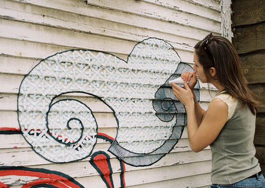
My inspired artist that I chose is Shelly Miller. Shelly miller is an artist who uses deigns and calligraphy to create graffiti, but it has a twist. The only medium she uses for her art is icing. Although she also does permanent graffiti, she is most known for creating amazing deigns in public places out of icing. Shelly has artwork that has been recognized and commissioned in places across Canada, Brazil, Australia, and India. Each piece of artwork she does is inspired by the history of that area and the surrounding material around her work such as brick.
Shelly's website is here. This inspired me a lot because I have always since I was little watched cooking shows on tv like cupcake wars, cake wars, cake boss, and the baking championship series. She's drawn my attention because her artwork is so amazing and her ability to work so hard on a project just for it to go to waste when it rains. Most cake decorators make them indoors and show them off or have people eat them. Shelby takes her time making something boring interesting and exciting and doesn't care if it's gone within a few days. It's incredible how talented she is and it amazes me.
Shelly's website is here. This inspired me a lot because I have always since I was little watched cooking shows on tv like cupcake wars, cake wars, cake boss, and the baking championship series. She's drawn my attention because her artwork is so amazing and her ability to work so hard on a project just for it to go to waste when it rains. Most cake decorators make them indoors and show them off or have people eat them. Shelby takes her time making something boring interesting and exciting and doesn't care if it's gone within a few days. It's incredible how talented she is and it amazes me.
Drawing Unit
Composition- the placement or arrangement of visual elements or ingredients in a work of art, distinct from the subject of a work
Value- the element of design that defines the lights and the darks
Value- the element of design that defines the lights and the darks
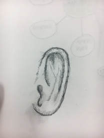
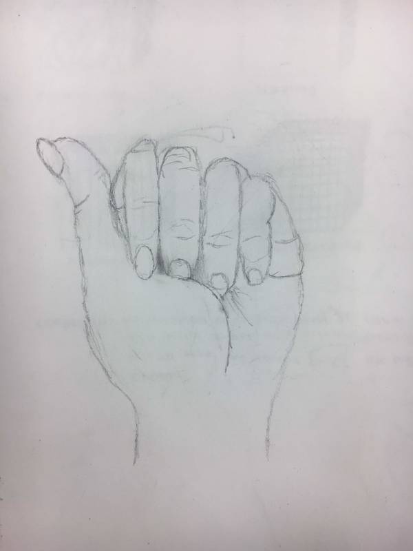
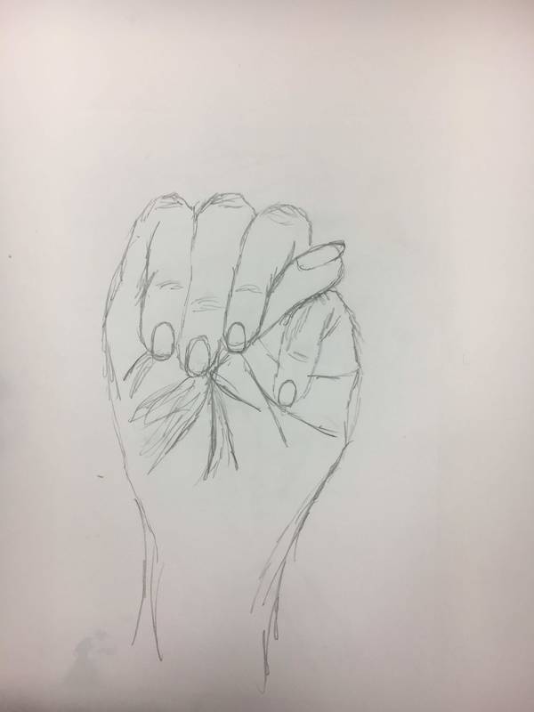
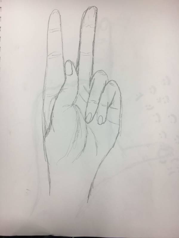
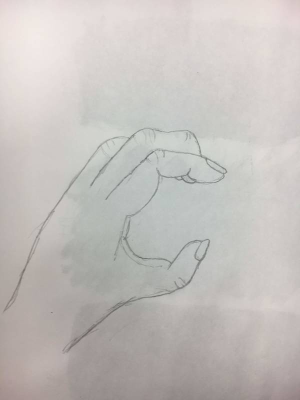
Pen Drawing:
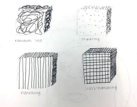
There are many pros and cons to using pen for a drawing. Using pen requires a lot of accuracy, because the pen is permanent. You can start out with an extremely light pencil outline of whatever it is that you are drawing, but the detail should be done in pen. One of the pros to using pen when drawing is there are many ways to draw in pen. Some ways include random line, cross hatching, varied hatch, and stippling. Being able to use these drawing techniques make it easy to get the shapes right of what you are drawing. One of the cons, however, is that when drawing with pen, it is harder to get shading right, in comparison to a pencil or some other drawing tools.
There are many pros and cons to using pen for a drawing. Using pen requires a lot of accuracy, because the pen is permanent. You can start out with an extremely light pencil outline of whatever it is that you are drawing, but the detail should be done in pen. One of the pros to using pen when drawing is there are many ways to draw in pen. Some ways include random line, cross hatching, varied hatch, and stippling. Being able to use these drawing techniques make it easy to get the shapes right of what you are drawing. One of the cons, however, is that when drawing with pen, it is harder to get shading right, in comparison to a pencil or some other drawing tools.
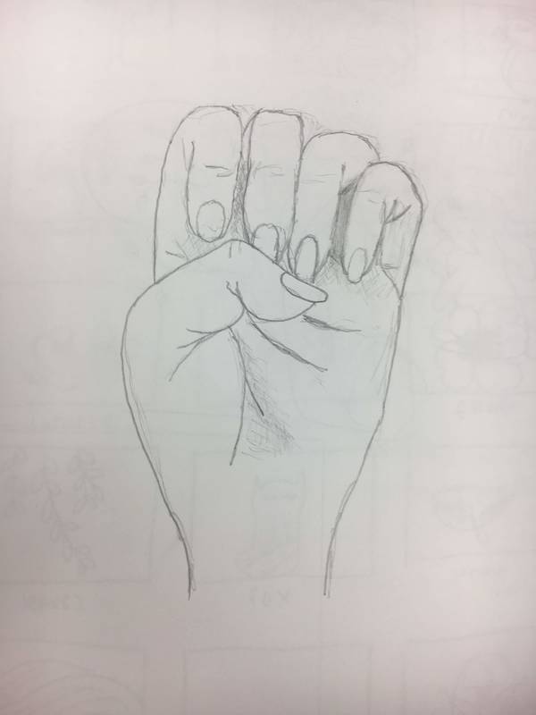
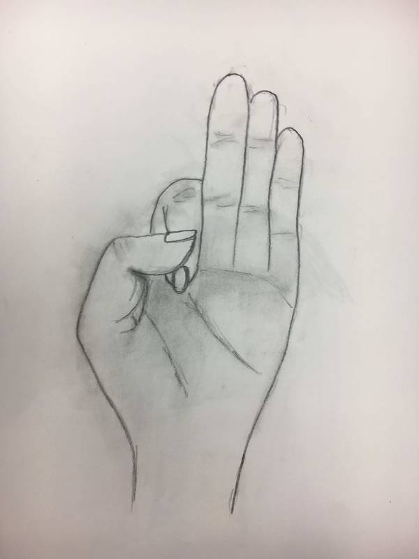
Charcoal Drawing:
Charcoal drawings often end up looking really cool in the end. Drawing with charcoal has many pros and cons to it. One pro is that it is very easy to correct mistakes, because you can just rub the mistakes off. Another pro is that the shading of your final product is often very good and well detailed. One con of drawing with charcoal is that it is very messy. Drawing with charcoal can also be difficult because when you touch the paper, it most often leaves fingerprints and you have to go back and reshade that area. Another con is that getting small details can sometimes be hard.
Charcoal drawings often end up looking really cool in the end. Drawing with charcoal has many pros and cons to it. One pro is that it is very easy to correct mistakes, because you can just rub the mistakes off. Another pro is that the shading of your final product is often very good and well detailed. One con of drawing with charcoal is that it is very messy. Drawing with charcoal can also be difficult because when you touch the paper, it most often leaves fingerprints and you have to go back and reshade that area. Another con is that getting small details can sometimes be hard.
|
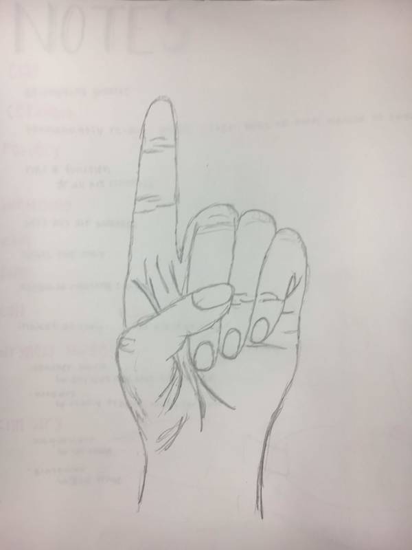
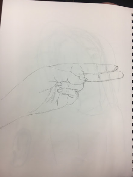
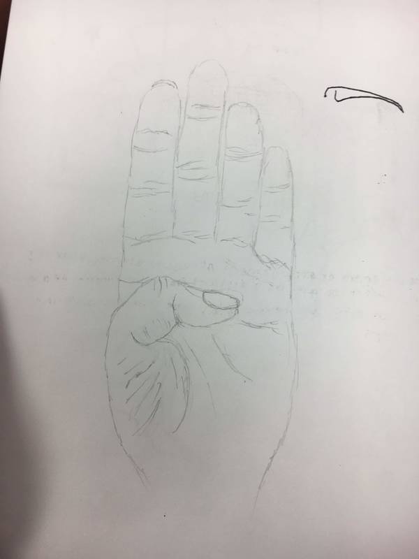
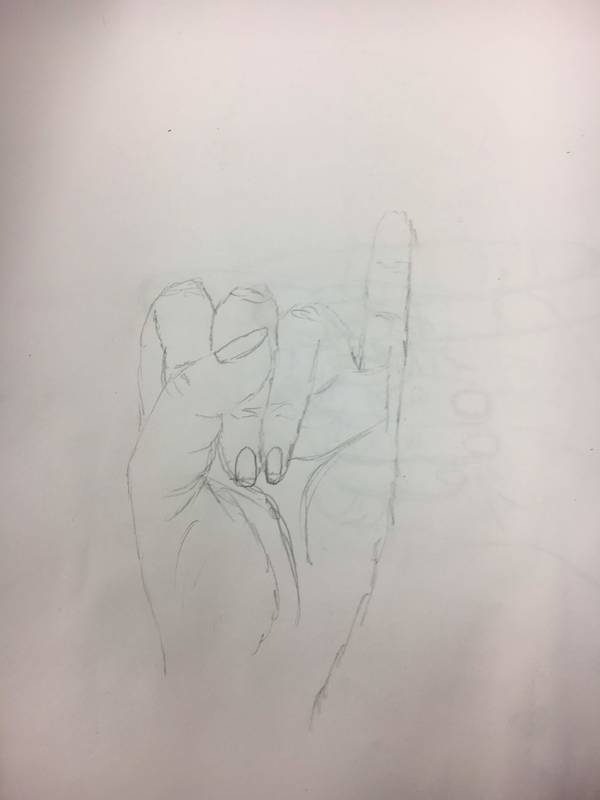
Pencil Drawing:
Drawing in pencil is my personal favorite, because it is much easier to get an exact image of what you want. One reason for this is because it is easier to correct mistakes. Therefore, one pro of drawing in pencil is the availability for accuracy. A con of drawing in pencil is it makes it hard to see the different shapes and clarify objects sometimes. Pencil makes it harder to add enough value so that all of the objects are noticeably different. |
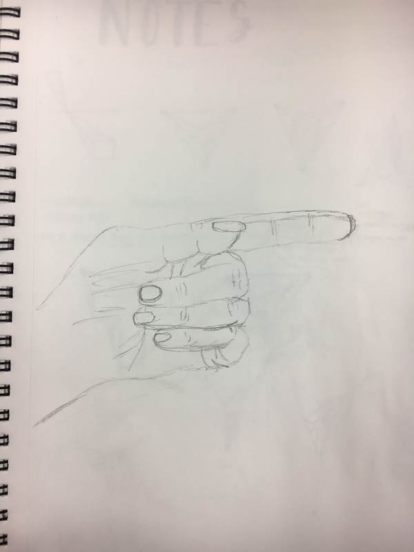
Favorite Warm-Up:
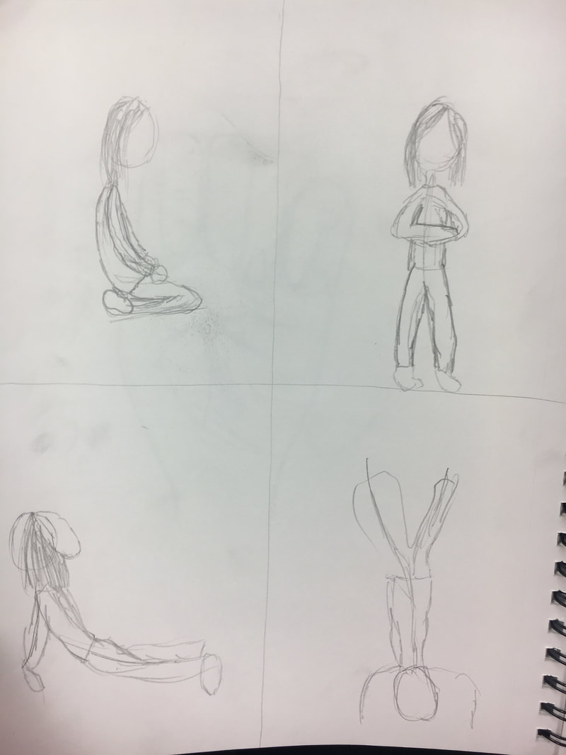
The warm-up that I found most helpful was learning the different drawing techniques for when you are drawing with pen. Learning these techniques helped me add better value to my pieces that I worked on. I found that stippling was my favorite technique, although it is also the most time consuming. These techniques made my pieces look a lot better overall.
The warm-up that I found most helpful was learning the different drawing techniques for when you are drawing with pen. Learning these techniques helped me add better value to my pieces that I worked on. I found that stippling was my favorite technique, although it is also the most time consuming. These techniques made my pieces look a lot better overall.
Learning Color/Paint Mixing
|
|
|
|
What did you learn from this Activity?
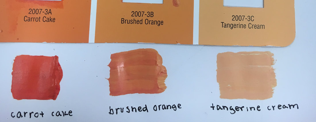
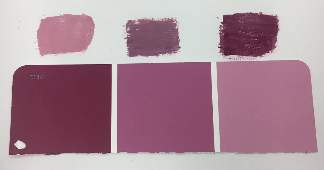
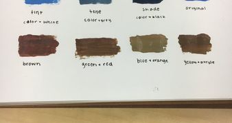
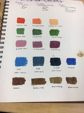
I learned how to better mix the colors I needed in order to have the right blend of colors in my painting. I ended up using the light orange that we mixed for the sunrise in my painting and it turned out to be a very pretty color on my painting and matched the image very well. I also learned how to fix the colors that I blended if I needed to when they were off from the pain chips by adding more white or black to my color to get it right. How do you mix brown?
I always thought that making brown was just mixing a bunch of random colors together and hope that it comes out as a brownish color that you can lighten or darken as you wanted. I never realized that there are multiple ways to make brown and some are very simple while others are harder. The 3 main ways that we learned was green and red, blue and orange, and yellow and purple. You always need a primary color and secondary color that are analogous. |
|
The Idea of Place
|
In-Progress Painting
|
Finished Painting
|
|
Favorite Warm-Up:
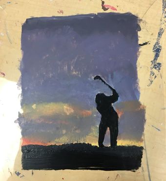
My favorite/most helpful warm-up was the hue value scale. I didn't really need the textures for the picture I chose to do so I was able to get a lot of benefit from the hue value scale and mixing the different colors to find the shades that I needed for my painting. What place is represented in your art?
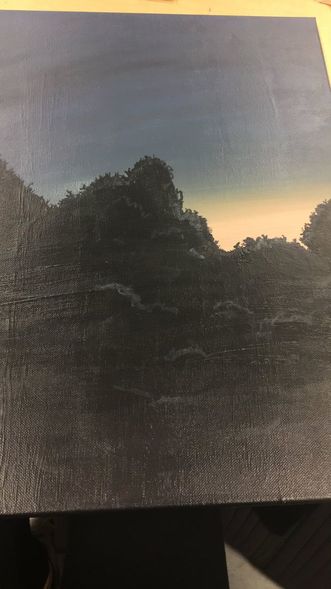
I chose to do a trees and the sunrise from my old bus stop in 9th grade. It's important to me mostly because I thought it was really pretty that morning and I wanted it to take a picture of it and looking back I miss that because i'm not at that bus stop anymore and I used to sit every morning and wait for the bus and it was always so peaceful then. Overall, it's not super important to me but it made me feel better in the morning when there's a really pretty view. |
|
Most Challenging
For me the most challenging part was making the trees look like they were glowing. It was hard to make the light paint look watery and make it look like it was glowing through the trees. It was also hard to fade the water color and make it look more concentrated by the brighter side of the sunrise than by the darker sides. |
Most Successful
My favorite and most successful part of my painting was making the sunrise and blending it. During the critique, almost everyone commented and liked my mixing and blending of the sunrise. I really liked how I was able to blend it while it was still wet and make it look like a really accurate fading going from dark to light. I also really like the details on the tree with the little swipes of black that made it look like branches and leaves. |
Process of the Painting
I didn't have a very big process but I started with mixing and painting all of the dark and light colors of the sunrise. Once I mixed and blended my sky, I started to work on the trees and I made them in black and a really small amount of purple to make it have a little bit of a purple shading. I wasn't very happy with how it came out so I ended up taking a really small paint brush and swiping little streaks of black on the painting at the top of the trees to give it detail. I really liked how that ended up turning out and creating a design on the trees. Lastly, I added the watercolor to the trees to make them glow. It wasn't my favorite, but from farther away it made a small difference.
I didn't have a very big process but I started with mixing and painting all of the dark and light colors of the sunrise. Once I mixed and blended my sky, I started to work on the trees and I made them in black and a really small amount of purple to make it have a little bit of a purple shading. I wasn't very happy with how it came out so I ended up taking a really small paint brush and swiping little streaks of black on the painting at the top of the trees to give it detail. I really liked how that ended up turning out and creating a design on the trees. Lastly, I added the watercolor to the trees to make them glow. It wasn't my favorite, but from farther away it made a small difference.
Sculpture Vessel Project
--IN PROGRESS--
|
|
What do you plan to do with your piece?
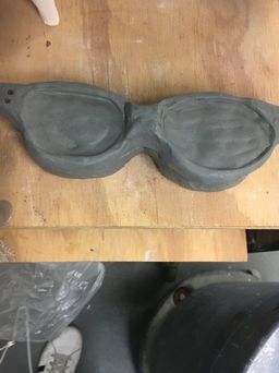
For the most part, I finished all of the sculpting to my piece and now have to work on the painting once it has gone through the kiln. I decided to do a design on the side of the piece so it didn't look so plain. I also carved and smoothed out all of the edges of the piece to make it look less choppy and sharp. |
|
What have you found most difficult?
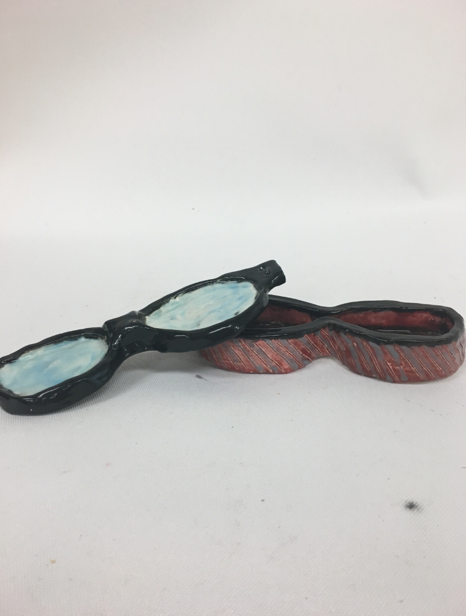
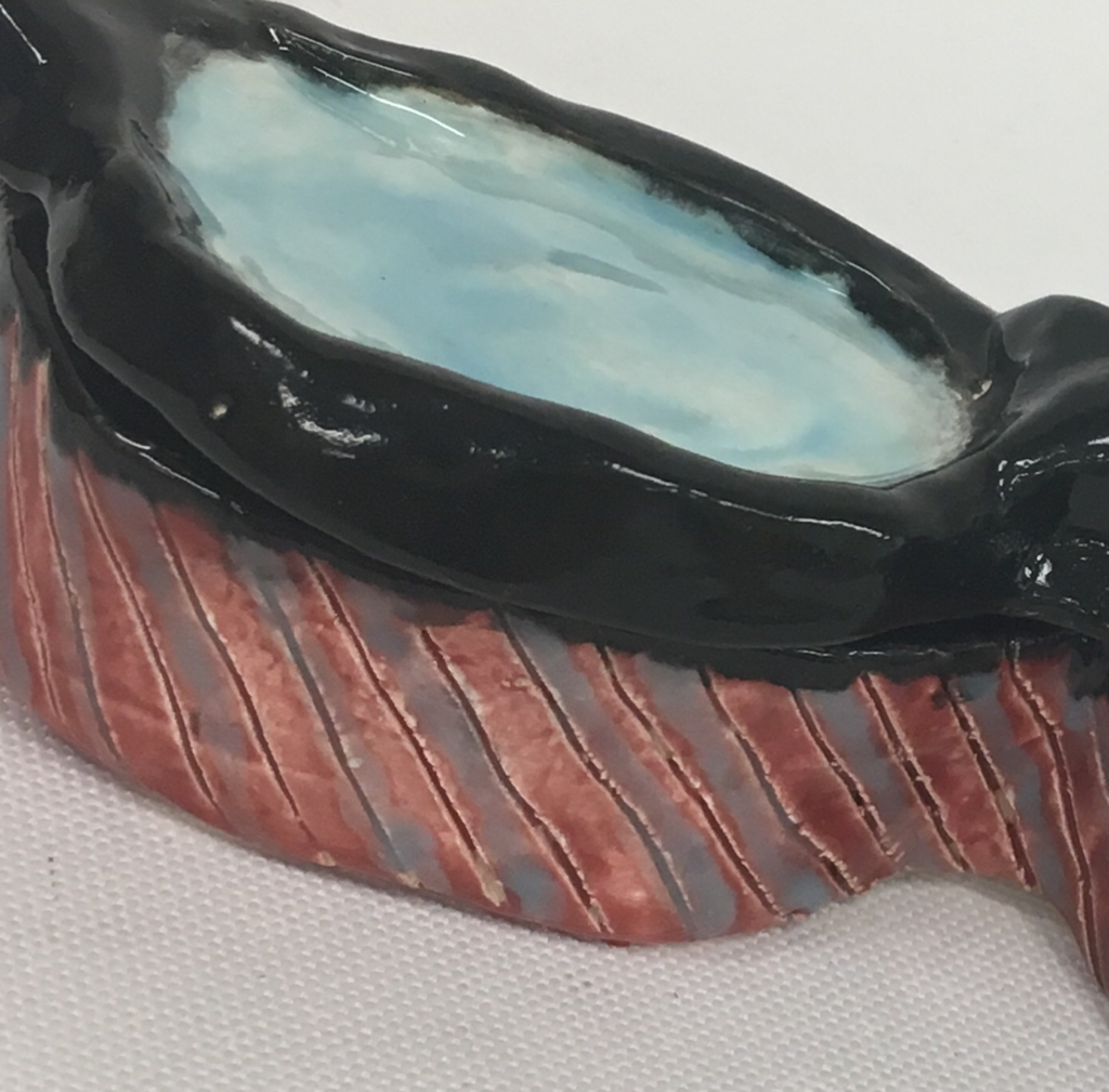
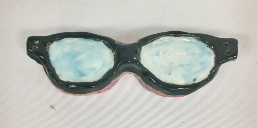
My most difficult part so far was probably carving out the lenses to make them look even. I struggles with carving too much out of one and having to crave the same amount out of the other one or making it look more smooth. Overall, I think the smoothness came out pretty good considering I struggled a lot on the smoothing. |
What have you found most successful?
So far I think I did pretty wall with the design around the sculpture ad I like how it ended up turning out. I also like the way I did the handles and found it successful with how I was able to connect them over to the sides of the glasses. I think I did pretty well with the base, sides, and overall shape of the piece. |
Explain the process you've used so far
So far in order to make the base I had to scratch and slip to make all of the pieces connect together into the glasses form. I used slabs throughout my entire project to make the sides and tops of my piece. Once I used the slip method to smooth out all of my edges so they weren't sharp when it was fired, I then carved the stripes design into my piece. I was finished with the sculpting part after that and this is as far as I have come.
So far in order to make the base I had to scratch and slip to make all of the pieces connect together into the glasses form. I used slabs throughout my entire project to make the sides and tops of my piece. Once I used the slip method to smooth out all of my edges so they weren't sharp when it was fired, I then carved the stripes design into my piece. I was finished with the sculpting part after that and this is as far as I have come.
--FINISHED--
|
What was your finalizing process?
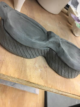
My process of completing my sculpture project was using glaze and not any acrylic paints. I decided to glaze it since I thought it would be more fun for this project. I also needed to attach 2 extra pieces when I re-fired my piece which ended up turning out well. Overall I like my finished piece. Explain the process you've used so far What I found most successful was how the lenses came out on my piece. I really like the mix of blue and white and how that came out. I think it looks more like glass than if I were to just use clear as the color of the lenses. What would you change about your piece? If I were to do this project again I would take more time to make the designs on the sides less sloppy and now I have more experience with glaze paint so I could mix the glaze to the colors I want better to make it turn out more pink on the sides since it turned out more red than I wanted it to. |
Meet Your Mentor
|
Name, what they do, and digital portfolio link?
My mentor's name is Isabelle and she is in the AP Sculpture class so she works a lot with clay. She's very nice and good at teaching how to use things for our sculpture vessels. Overall I look forward to working with her. This is her digital portfolio |
How do you think you will benefit from this?
I believe that having a mentor will help me better perform in my art skills and abilities since I am now able to ask Isabelle if I have any unanswered questions on a project since she was in this class before and can especially get help with our sculpture project since that is her main focus in the art class that she is in now. I hope that she will be able to help me with the minor details of my projects since the minor details are what makes our projects that much better. |
Linocut Printmaking
|
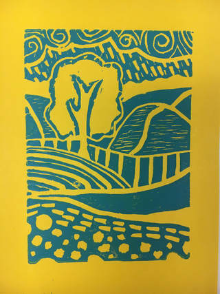
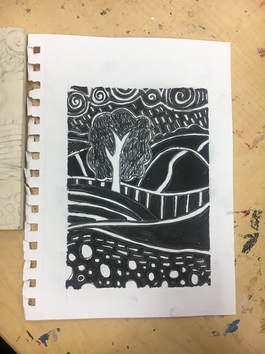
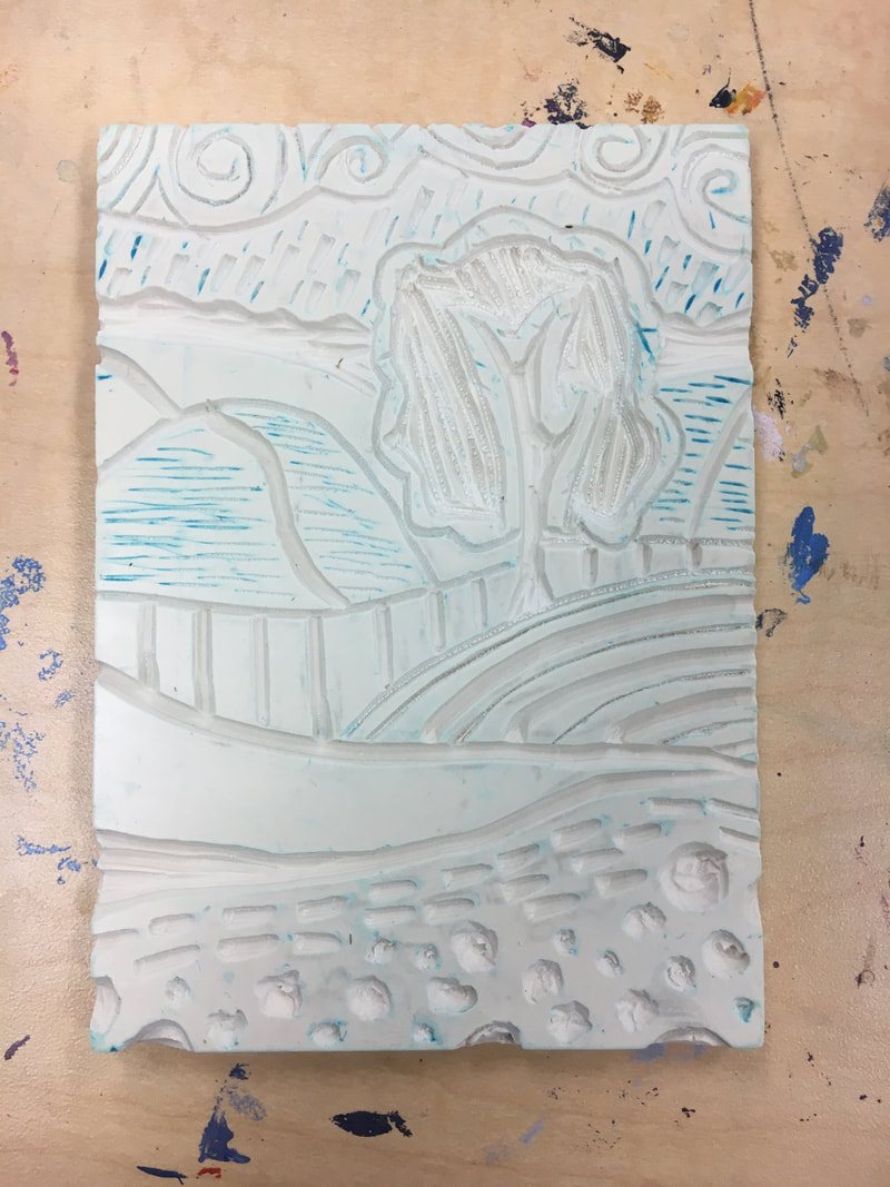
How does your piece show off the theme of "line"?
I used lines all throughout my piece with the swirls, hills, and tree. I used a mixed variety of thick and thin lines on each hill and had them going both vertical and horizontal to add to the theme and make each hill stand out more. Overall I believe I was able to portray the theme better by doing this and my piece is pretty much a bunch of lines going all throughout it to create this effect of a tree on hills.
How was the piece successful and what would you change about it if you could do it again?
If I had to do this piece again I would definitely change the tree. I would probably do thin diagonal checker-board-like lines instead of just carving out the entire tree leaving an outline. It ends up leaving a pretty big blank space and I don't like how that ended up turning out. Other than that, I think this piece ended up turning out pretty well and I like how the hills with the thin horizontal lines turned out the most. I believe this was a pretty successful piece. |
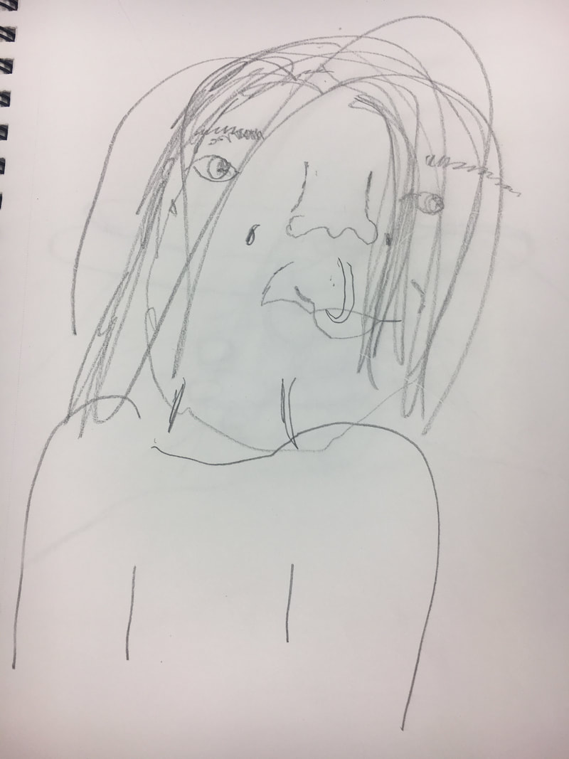
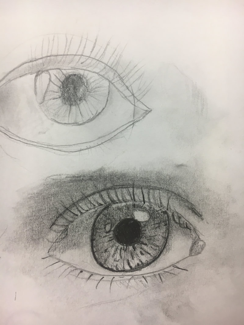
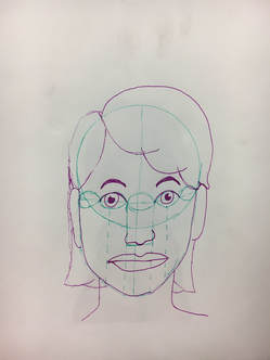
Portrait Project
--WARM-UPS---
|
|
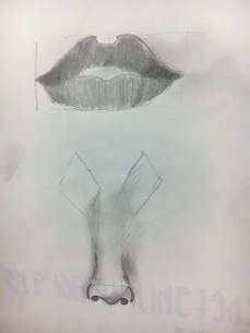
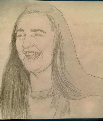
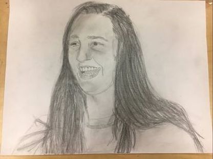
What warm up was the most helpful in your portrait piece?
The most helpful warm up for me was the nose. I struggled on the nose for my drawing so the nose and shading for the nose helped me to make her nose look better and more three-dimensional. What did you find most surprising about the facial proportions and why?
The most surprising thing to me was how the eyes are in the middle of the face. I always thought they were towards the top of the face because your hair covers a lot of your forehead.
|
--FINISHED PIECE--
|
Who did you do your portrait of? Relationship?
I did my portrait of Anna Broome and she's my best friend. We did a photoshoot from a canon camera about 7 months or so ago so I took the one of her laughing and used it as my drawing. What medium did you use?
I used paper and pencil as my medium for this project. Explain your process
My process for this was pretty simple overall, I ended up using my picture and printing it out then using that to base my drawing. I did a basic sketch then shaded her face and body to make it look more realistic. |
|
What do you find most successful?
I found the eyes and hair the most successful and the way her eyes turned out squinted. I also like the hair and how it looks pretty detailed with the individual strands. |
What would you change?
I would probably focus more on making the shading look more detailed and make the shading on her forehead smoother so it looks more 3D. I would also maybe use a different medium to go out of my "comfort zone" and work on mediums that could use more perfecting than a medium i'm already strong in. Other than that I believe this piece was pretty successful and I liked this project. |
Watercolor Project
|
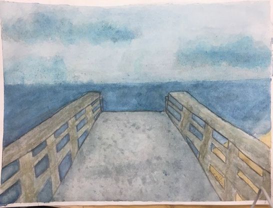
What did you find most difficult?
My most difficult part was probably making the railings not look so sloppy. With water color it was hard to blend the railings so it looked like wood and make the edges clean at the same time. I ended up going over the lines with a pencil at the end which was what really helped me in the end to make the edges cleaner but I wish I was able to make it cleaner without needing pencil lines. Overall, I like how it turned out and the way the boardwalk is shaded and the texture of it. |
|
Tell me about the photo. Where did you take it?
I took my picture sometime last year on a beach trip that I went on with my family. I was walking along the beach with my sister then the sun started to set so we went back but the sky and boardwalk looked really pretty so I decided to take a picture of it. How did the warm-ups help?
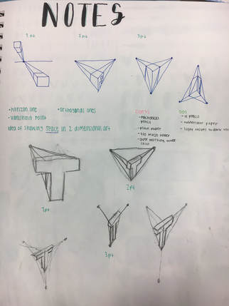
The warm-ups I picked were the intro to watercolor and copy a book. One I picked that helped was the copy a book and that really helped me perfect my layers and use different shadows and layering techniques to really make the piece come to life and look just like the book. It also brought out the texture and helped me to see the rock and different shades of it. The 3D letters also helped a lot. I picked this because I was struggling with what each perspective looked like for a while and this really helped to better my understanding of what each perspective meant and how they are supposed to look. What perspective did you use?
I used 1-point perspective. I can tell because there's a horizon line and I can use a ruler to connect the edges of the boardwalk together when they're extended. |
Multimedia Project
|
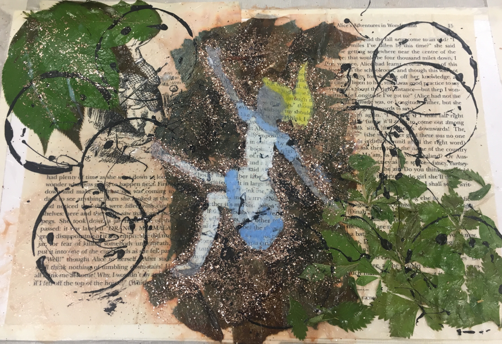
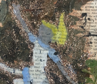
How many different mediums did you use?
I used 6 different mediums on my piece. I used glitter, acrylic paint, watercolor, plants, tissue paper, and book paper. The glitter was used to outline Alice and create more of a magical effect. The acrylic paint was used to create rings/circles around my project to give it more of an abstract effect and fit my theme. The watercolor was used on Alice to color in her dress and face and hair. I added bits of acrylic paint on her dress and hair to make her stand out better and see her look like she's falling. I used plants such as the leaves to create a semi-border effect and add in a pop of color. Lastly, I used brown tissue paper to create the dirt tunnel effect in my piece that she is falling down. How many techniques did you use?
I used 5 techniques on my piece. I used modge podge for leaves, colored modge podge for the old-book effect, a lid to create the circles on the piece, paint brushes to color in Alice and brush around her to concentrate the glitter, and a paint brush for the spots of paint that I flung on my piece. |
What was your word and how did you portray it?
I used Alice in Wonderland as my theme and I wanted to do her falling down the hole since when I go to therapy, my therapist says that I'm like Alice when she falls down the hole into darkness, so I honestly wanted to make fun of what she said and make a piece on it. So i came up with this to make it seem magical and overall just make fun of her. I portrayed it by using the book pages from while she was falling down the hole as my background and I did the other things I mentioned above for the rest of my theme.
I used Alice in Wonderland as my theme and I wanted to do her falling down the hole since when I go to therapy, my therapist says that I'm like Alice when she falls down the hole into darkness, so I honestly wanted to make fun of what she said and make a piece on it. So i came up with this to make it seem magical and overall just make fun of her. I portrayed it by using the book pages from while she was falling down the hole as my background and I did the other things I mentioned above for the rest of my theme.
Final Exam
Critiquing Process
The critiquing process can be broken down into four simple steps. Each step is simple to understand, but some have more importance to the process as other steps. Though, overall, each step is still needed to give a proper critique. The steps to the critiquing process are listed:
1. Describe- Tell exactly what you see. Observe the detail in whatever you are critiquing, and look for the contribution to the piece that each detail has.
2. Analyze- Use the elements/principles to reflect upon the art form. Form detailed descriptions of what you observed from the first step.
3. Interpret- Put into consideration, some specific questions: What is the artist trying to say? What caused the artist to say it? What is the historical milieu that surrounds the work of art? Why was this work of art created in this style?
4. Evaluate- How successful or important is the work of art? Notice any affects the work of art had on anyone or anything.

|
My Critique: Acrylic Painting
My description for this would be that I did a sunrise at my bus stop for my piece. I used a light peach color for the sunrise and darker colors for the top. I added detail to my piece by outlining the trees with small streaks of black to see the branches and leaves. I also added some extra water color to make the painting look more realistic from further away. For my analyzing step, I used the shades of colors such as blue, purple, black, orange, and white as my colors. The peach tint was used to create the main point of focus for my piece. The purpose of my painting was to create a balanced shading of the sunrise and create a silhouette look on my piece. I ended up doing this so I could really focus on detail of the trees and the individual branches coming out of the top. Lastly, I believe my piece was successful in creating a balance for what I wanted to work on/get done for my piece. The only thing I would change is to spend more time on the highlighting of the silhouette. |
Questions

|
1. What is the point of this class? What did you get out of it?
I was able to get a lot out of this class. The purpose of this class was to learn techniques for each of the styles of art, and to learn all the mediums of art. Through this class, I could gain knowledge on all the mediums, including terms that would improve my work. By terms, I mean techniques and aspects such as value. I was also able to take this class and find out what my favorite and/or specialty mediums are. I found that my best medium is pencil. I work best in pencil, because I usually enjoy adding extra details to my pieces by shading and I'm good at looking at pieces as individual shapes. The self portrait definitely helped me strengthen this skill. |
|
2. What did you find most difficult about this class? What could be done in the future to prevent it?
I found taking my time with my projects was hard for me. I have OCD so when something I work on isn't finished during that class period I tend to get frustrated and try to rush through the end so I don't have that urge to finish it the next day and stress myself out. In order to prevent it I just have to make sure I can work and get to a stopping point where I feel satisfied enough to be able to pick it up again the next day. For example with my printmaking, I wish I spent more time on it originally instead of being so focused on getting it done and didn't add a lot of detail. I'm learning to cope with this struggle and am slowly getting better at it. |

|
|
3. What is a technique that you used in your artwork that worked well? Explain what technique it was and why it was successful.
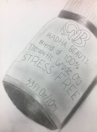
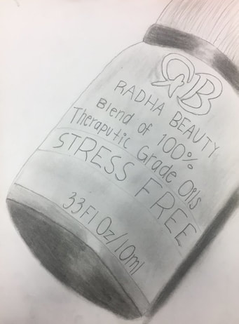
The technique that I made sure to use the most was value. Adding value to all my pieces with shading and highlights, helped me to make my pieces more realistic. Value is an element of design that defines light and darks in an artwork. You can add value to a piece of any medium. For example, I was successful with the shading of the essential oils that I did. As mentioned in a previous answer, my specialty medium is pencil, so those pieces are where my value is portrayed the best. Again, adding value to my artwork helped me to make my pieces much more realistic. |
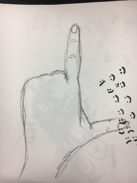
Santa Fe Drawing
|
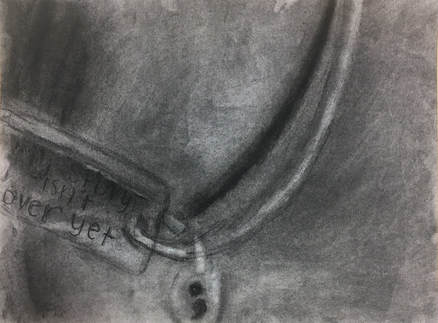
For my project I did a Santa Fe shooting piece. I drew a picture of a girl and outlines her and the arm in sharpie, and did the words in sharpie. I ended up using colored pencil to fill it in and used more colored pencil to outline some of the words and make a highlight fade where the hands are to emphasize it.
|
Alphabet Letters
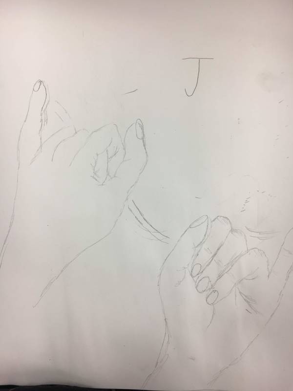
|
|
|
