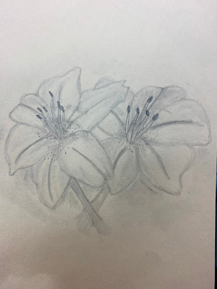
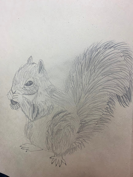
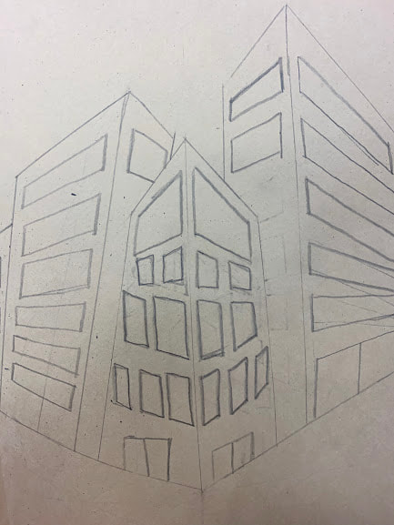
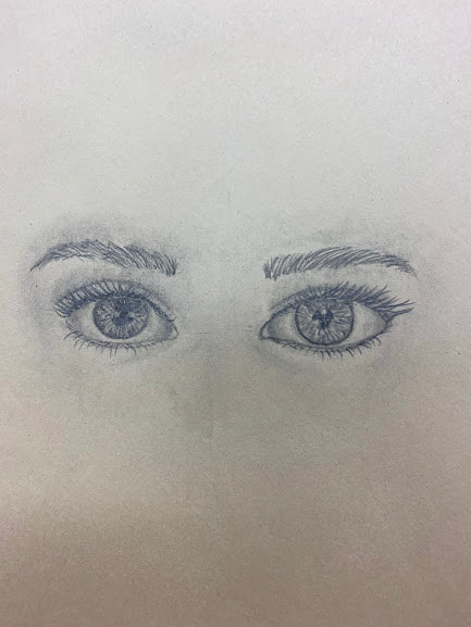
Starting Drawings
|
|
|
|
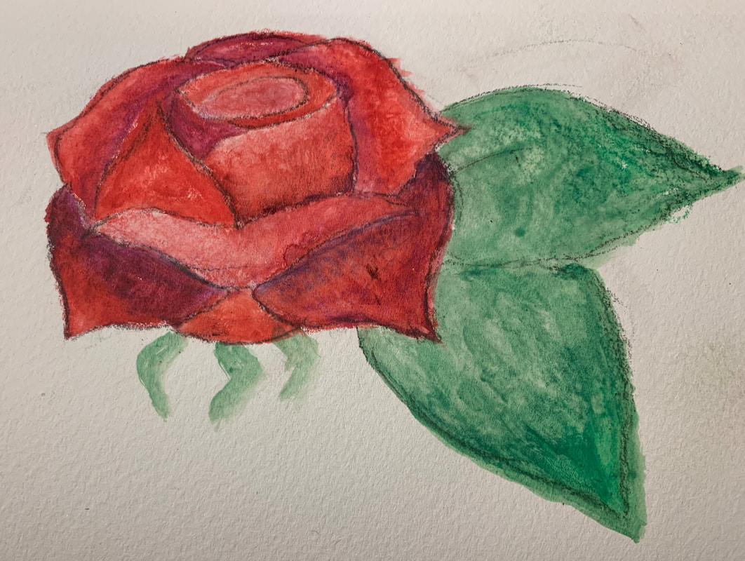
In this mini project, we were supposed to see where we started in art 2 by drawing. I had to draw flowers, an animal, a 3-point-perspective street scene, and a face or eyes.
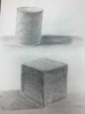
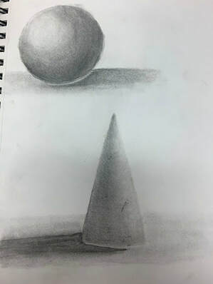
Shapes
|
|
|
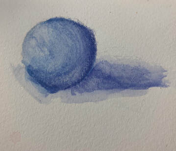
In this mini project, we got used to shading in black and white and with colored pencils. It helped to learn the techniques of shading and what to do or not do.
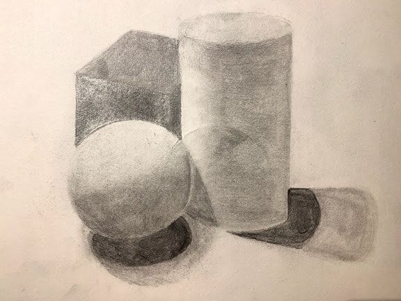
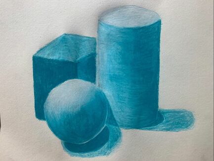
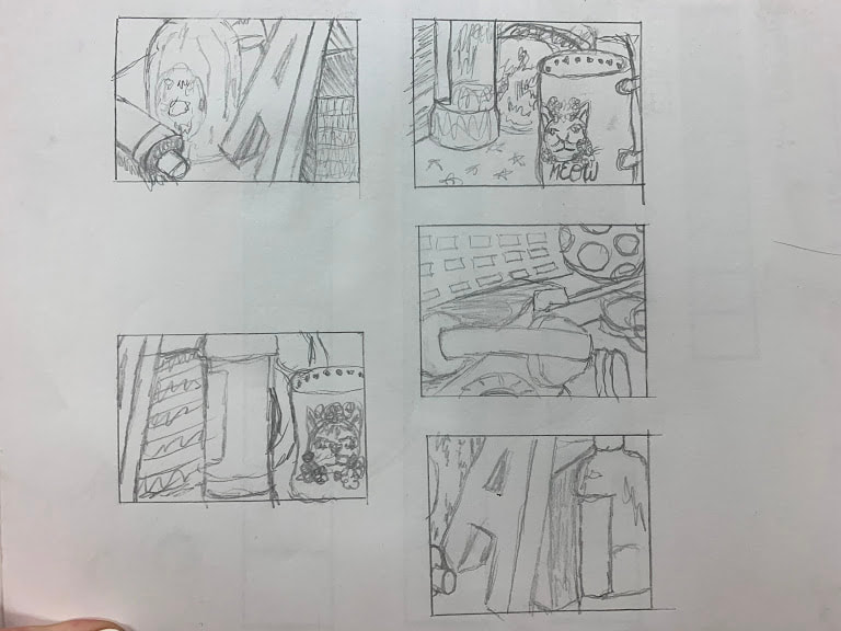
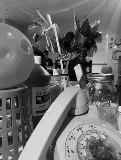
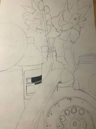
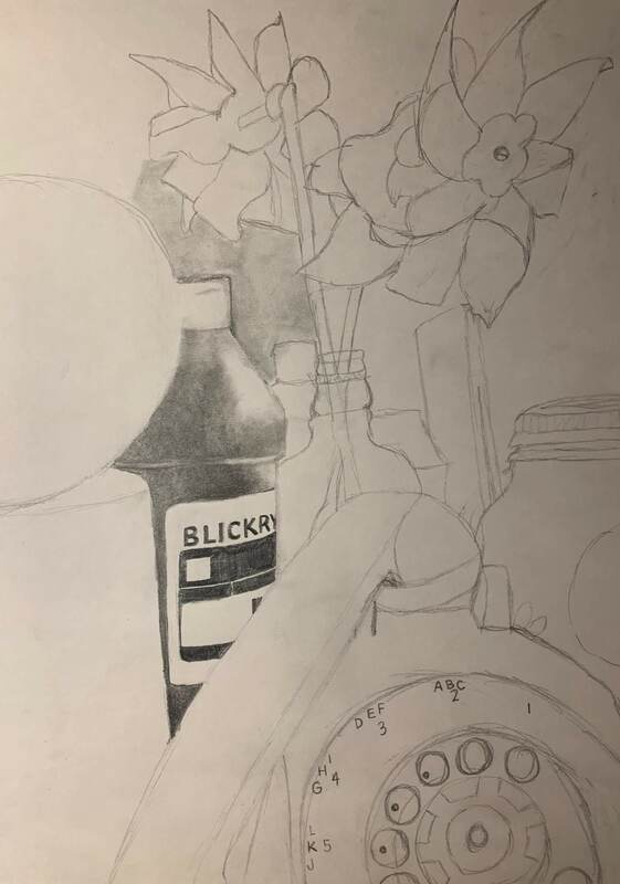
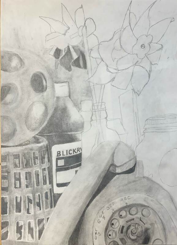
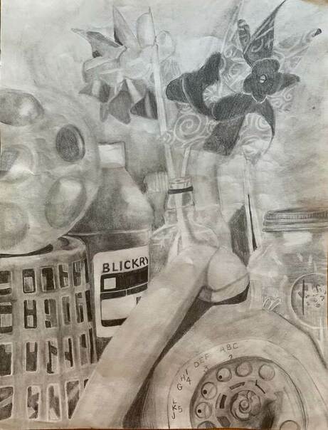
Still Life Final
|
|
|
|
|
|
Describe how you arranged your composition. Discuss your use of the elements and principles. Is it a successful composition?
I arranged my composition by taking my paper rectangle and trying to fill up as much of the box with objects as possible. I originally did it horizontally with the mug, but decided to switch it up since I was getting frustrated with the angle and didn't like it. The elements I used were space, I tried to take up as much space with the objects as I could. I also used a lot of value to find the different shades of my piece and the darker vs. lighter areas. I tried to use texture in order to show the different textures in the basket with all of the holes. The color I used was all gray scale. I feel like overall it had a successful composition, I just wish I had more time to work on it. Did you use a wide range of values? (A range from white to black with at least 9 values). Explain how is this evident? Yes, some of the parts in shading that I used were very light, almost white colors while others were almost completely black, such as the parts of the paint bottle. Most of my piece was more of a medium shade, including the background. Explain how your knowledge and creating practice studies with value contributed to your piece. Having taken drawing already, I found this a lot easier than peers, since we already did a still life. I was able to use what I learned from drawing class on this piece in order to have a successful piece. |
Describe the blending and transitions in your objects (discuss your use of pressure with pencil and other techniques to achieve this).
My piece used a lot of blending with each of the shadows. Some of the lines were harder lines while others were very soft and I could use a tortillian to achieve my blending techniques. I used more pressure on the darker shadows and labels and a lot less pressure on the highlighting in my piece.
Explain how your interpretation of texture is essential in capturing the look of the object.
Knowing how to use texture is critical with things such as shadows that are casted. In the background of my piece on the A, my shadow was very hard and I had to get the texture and shadowing right while on the highlights of the basket, I had to practice texture to keep it looking smooth.
If you could recreate your pieces what would you do differently to enhance the final outcome?
I would spend more time on the background or the objects in the background. I started getting frustrated and rushed through the background quicker than I should have. This made my background look sloppy compared to the rest of my piece
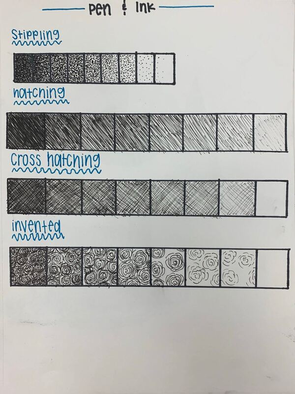
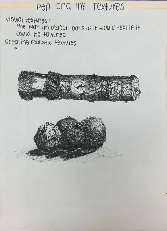
Pen and Ink Basics and Videos
|
|
|
We started off the pen and ink by working on the value charts of each type of ink values. We then applied those values to actual shapes and finished by watching video tutorials to focus on drawing textures with pen and ink.
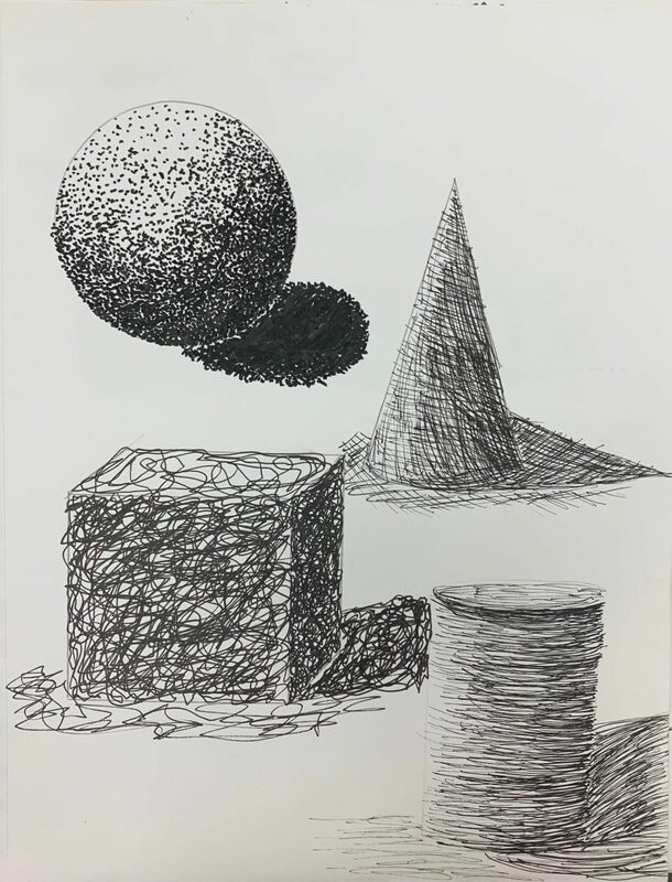
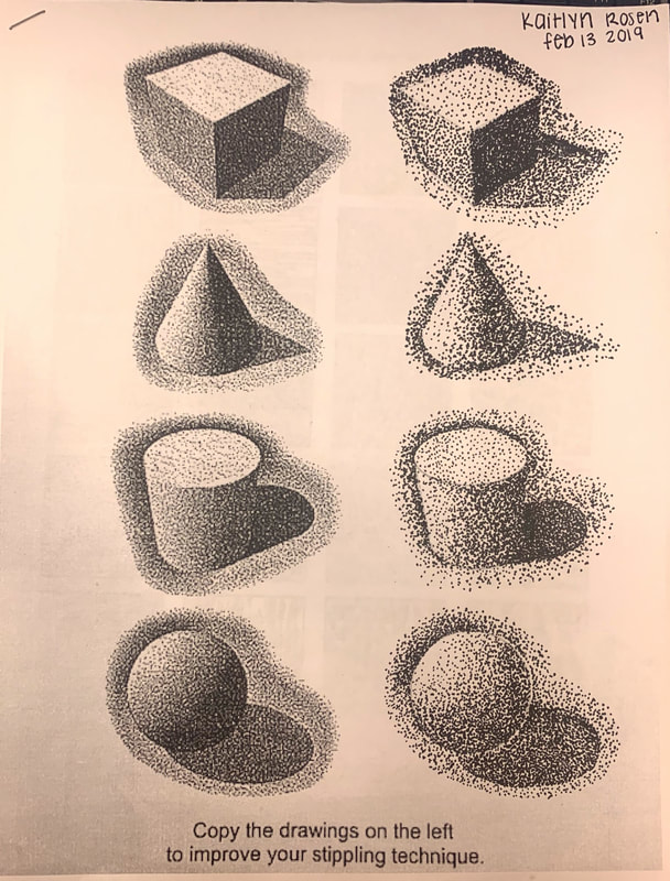
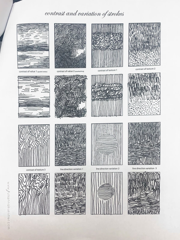
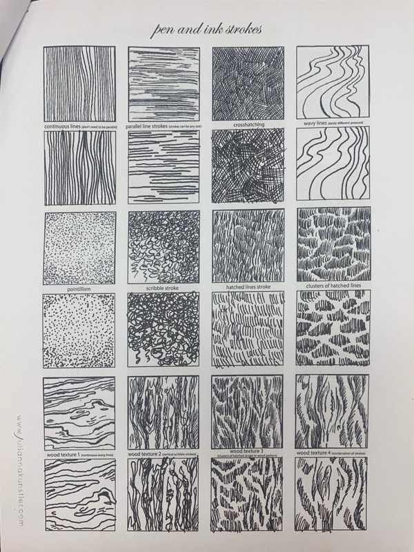
Pen and Ink Worksheets
|
|
|
These three worksheets helped us focus on getting used to using fine tip pens and helped us better improve each of the techniques, such as lines, stippling, cross hatching, etc.
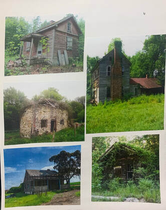
100 Textures and Landscape
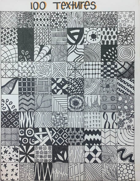
|
|
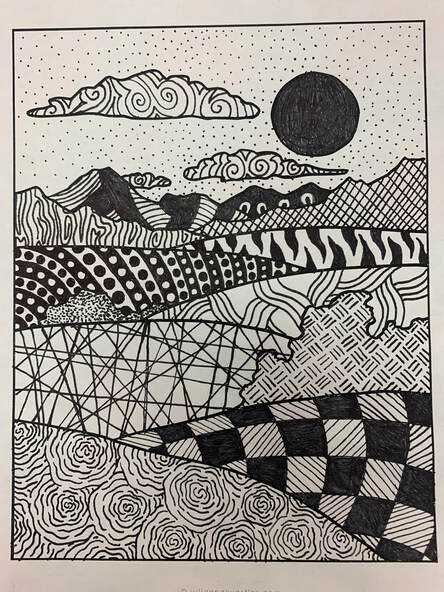
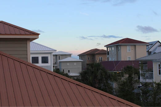
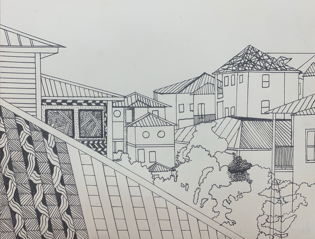
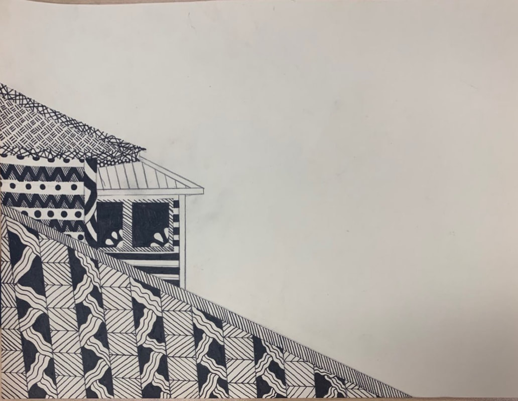
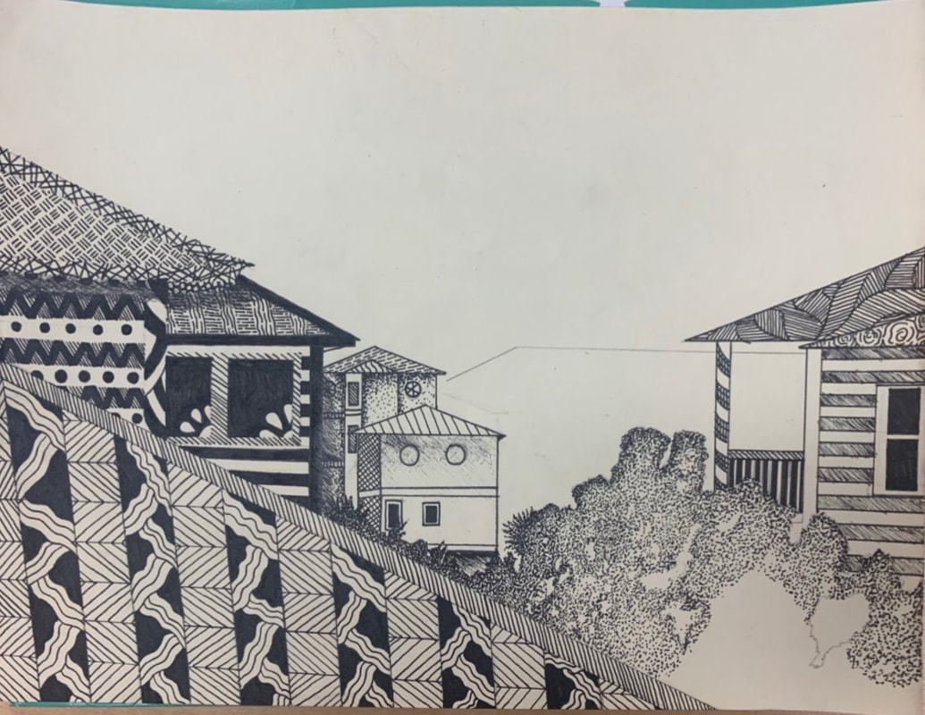
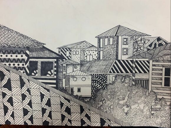
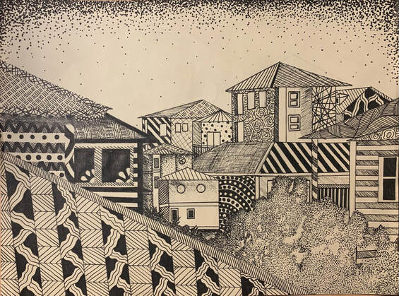
Final Pen and Ink
|
|
|
|
|
|
|
|
|
Describe how you arranged your composition. Discuss your use of the elements and principles. Is it a successful composition?
I didn't really arrange my composition, since it was from a picture that I took at the beach. Overall by the angle I took the picture, I'd say it was pretty successful. How is texture and pattern are important in your composition? Texture and pattern ate both very important to have dark and light designs to show the different shadows throughout the piece and the different layers for each texture of the roofs. Why is value so important in this project? Describe your craftsmanship (How well the project is crafted technically). |
It's very important to get the correct hues and shades throughout the piece so you can easily see the depth of the piece.
Explain how your knowledge and creating practice studies with value and pattern contributed to the success of your piece.
My knowledge in drawing helped me to have experience with lines ahead of time and contributed heavily to the point of view and perspective this was drawn from. This piece wouldn't have looked as strong if I went into this without any experience.
When applying the pen and ink/pattern techniques why and how is it important to make sure you understand the concepts taught in class?
A few things we learned in class were the pen and ink techniques, which are stippling, hatching, cross hatching, and inventive, and how to use those along with patterns to add value. In addition to learning about patterns, we also learned how to wrap patterns around object to make them look more three dimensional. All of these concepts were important in the project because using them helped make the piece look more realistic, even while it is made up of patterns.
As a growing artist how do you think what you have learned will guide and better your future projects. Explain.
If you could recreate your piece what would you do differently to enhance your final outcome?
This project will bring me better techniques when it comes to shading with pen and ink and it can help me to further perfect my different pieces with pen in the future. If I could recreate it differently, I would change some of the designs so you can easily distinguish the different houses and layers, since it got busy and some different designs blended together.
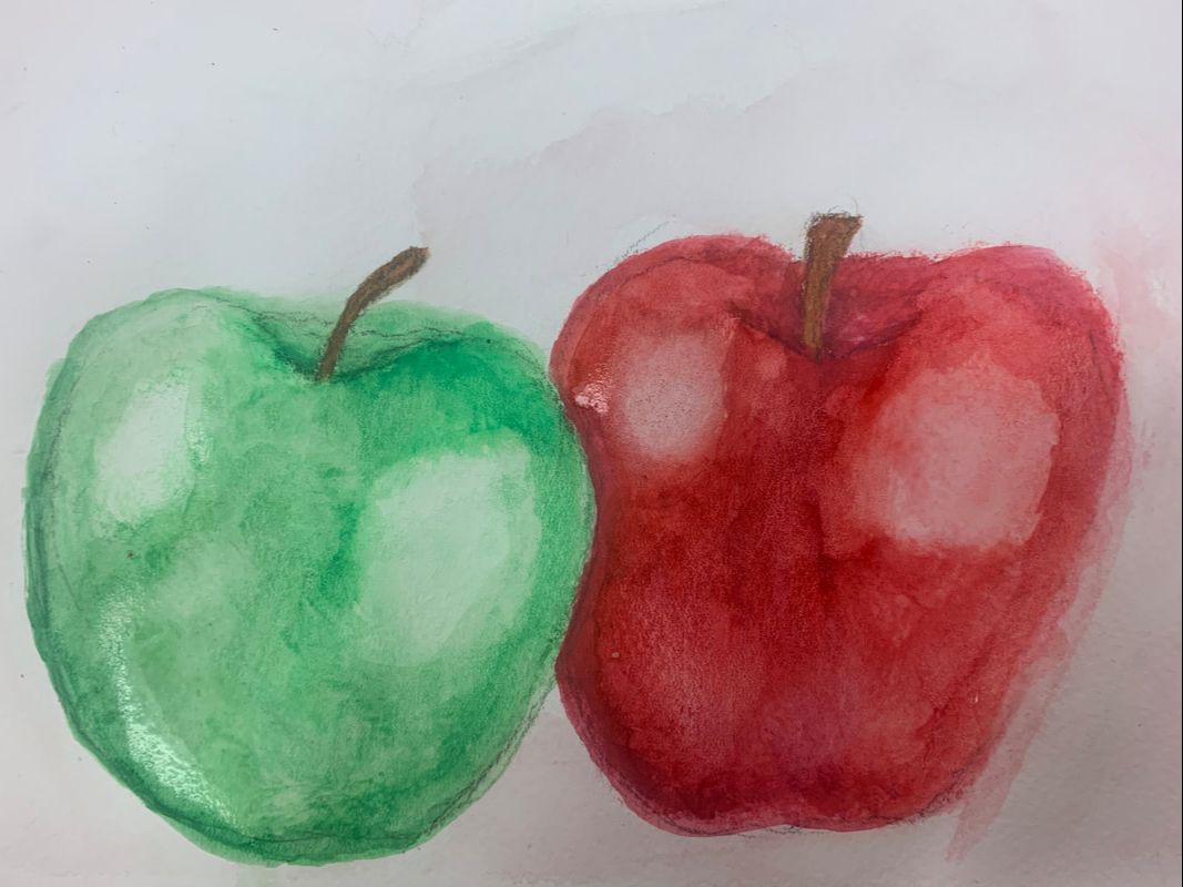
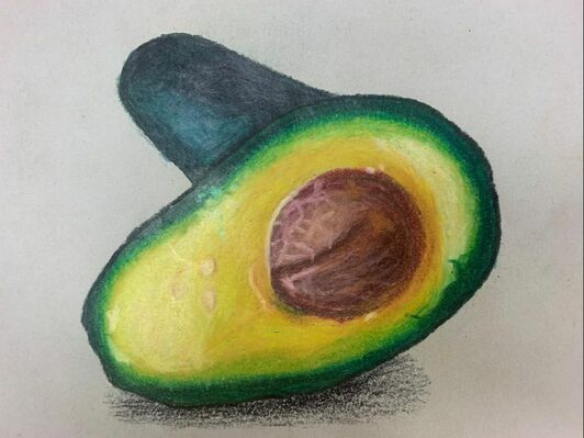
Prismacolor, Pastel, and Watercolor Fruit
|
|
|
In this we had to try different mediums, prismacolor, watercolor, and pastels. I found that I like prismacolor the most since you have the most control with prismacolor and it isn't as messy.
|
|
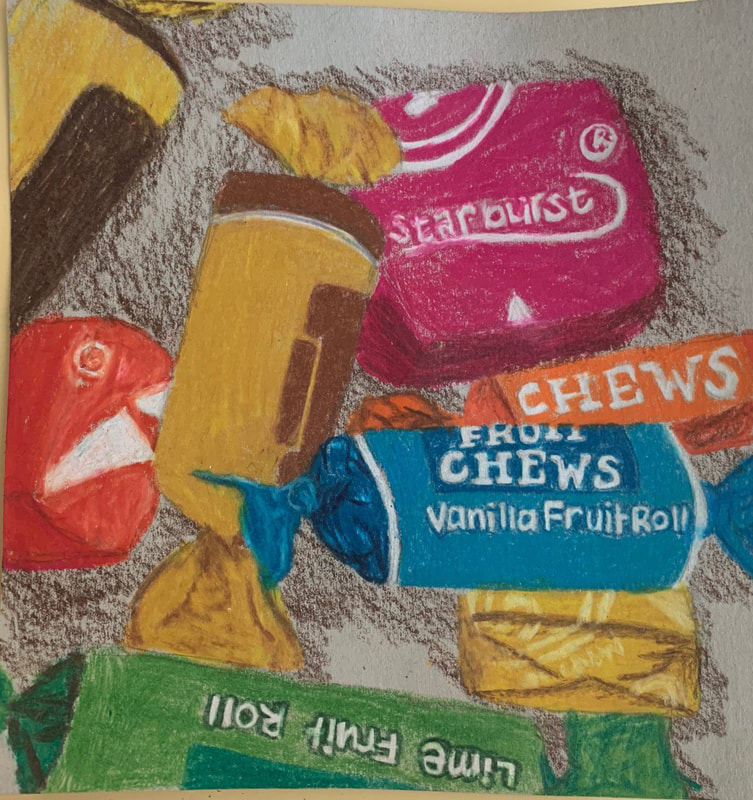
Prismacolor Candy Practice
|
|
This mini project was practice working with whatever medium we were going to use for our close-up final. I chose to take a close up picture of the tootsie rolls and starburst and use prismacolor as my medium
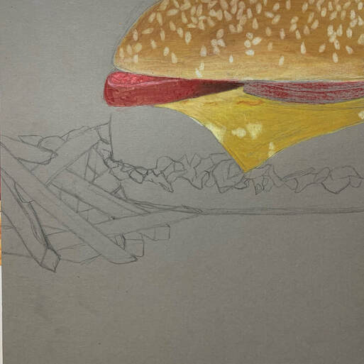
Prismacolor Final

|
|
|
|
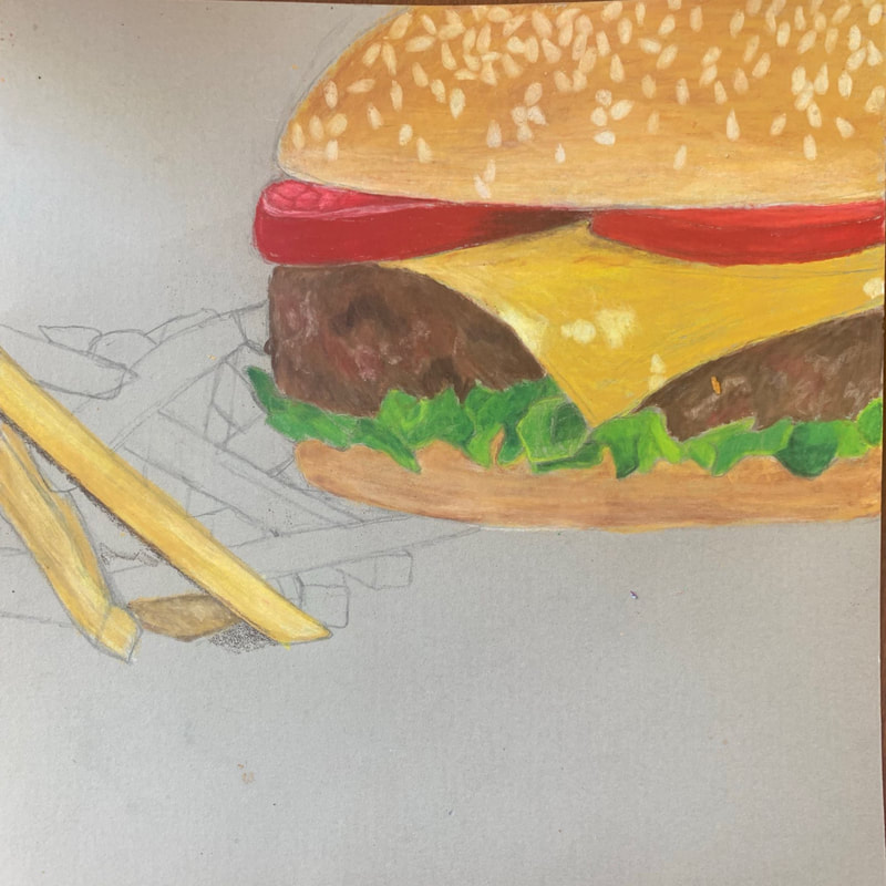
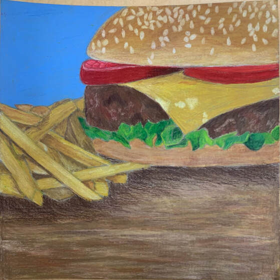
Describe the overall composition of your artwork (balance, unity, rhythm and movement).
The overall composition of my artwork created a sense of balance and unity through the different colors I used. I brought out the yellows throughout my piece like in the bun, lettuce, cheese, and fries in order to create the feeling of rhythm throughout my piece. The piece shows movement based on the way the fried are laying and the placement of the ingredients in the burger such as the way the cheese is laying. How did you use value to create dimension? Is this important? Why? I used lots of shadowing throughout my piece especially on the fries. This is very important because if we didn't use value the piece wouldn't look realistic since it would look two dimensional. Value is everything when working with all types of 2D artwork. What did you achieve by using exaggerated color? By bringing out my colors I was able to see different colors and values in my piece that I may not have seen otherwise, such as all of the different colors in my burger. The emphasis on specific colors in the piece helps to make the piece more realistic and smooth. |
Describe the craftsmanship of your colored pencil/chalk pastel. (How good the project is technically crafted)
Overall, I think my burger and background turned out the way I wanted with values and pops of color. When doing the fries, I was getting tired of the project and rushed through them quicker than I should have, so my values aren't as smooth and drawn-out as the values in the burger. Overall, I would say I did a pretty good job, I just need to focus and keep pushing through to completely finish projects as best as I can.
Were you able to achieve depth by showing a foreground, middle ground and back- ground? Explain.
Yes, my foreground was the table, my middle ground was the burger and fries, and my background was the blue wall. I like having the bright blue wall because it is smooth and adds a happier feel to my piece, and what's better than sitting down and eating a burger?! Overall, I am happy with the placement and use of depth throughout my piece, but if I had more time I probably would've added something to the foreground
Explain your experience with colored pencil/chalk pastel. What were the obstacles and advantages?
I am good with blending and using prismacolor, I just need to work on not pressing down so hard while drawing, since my paper gets waxy because I get frustrated with layering so much.
Printmaking
|
|
|
|
|
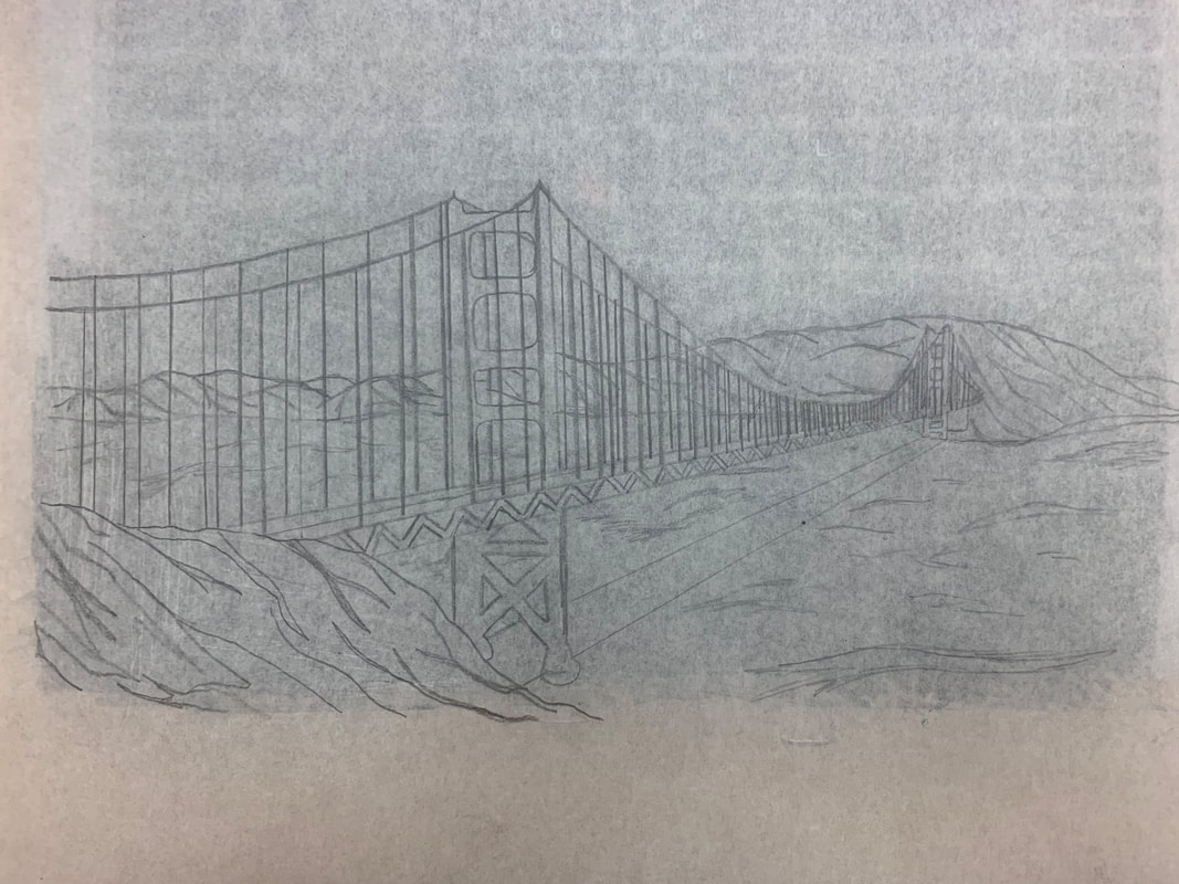
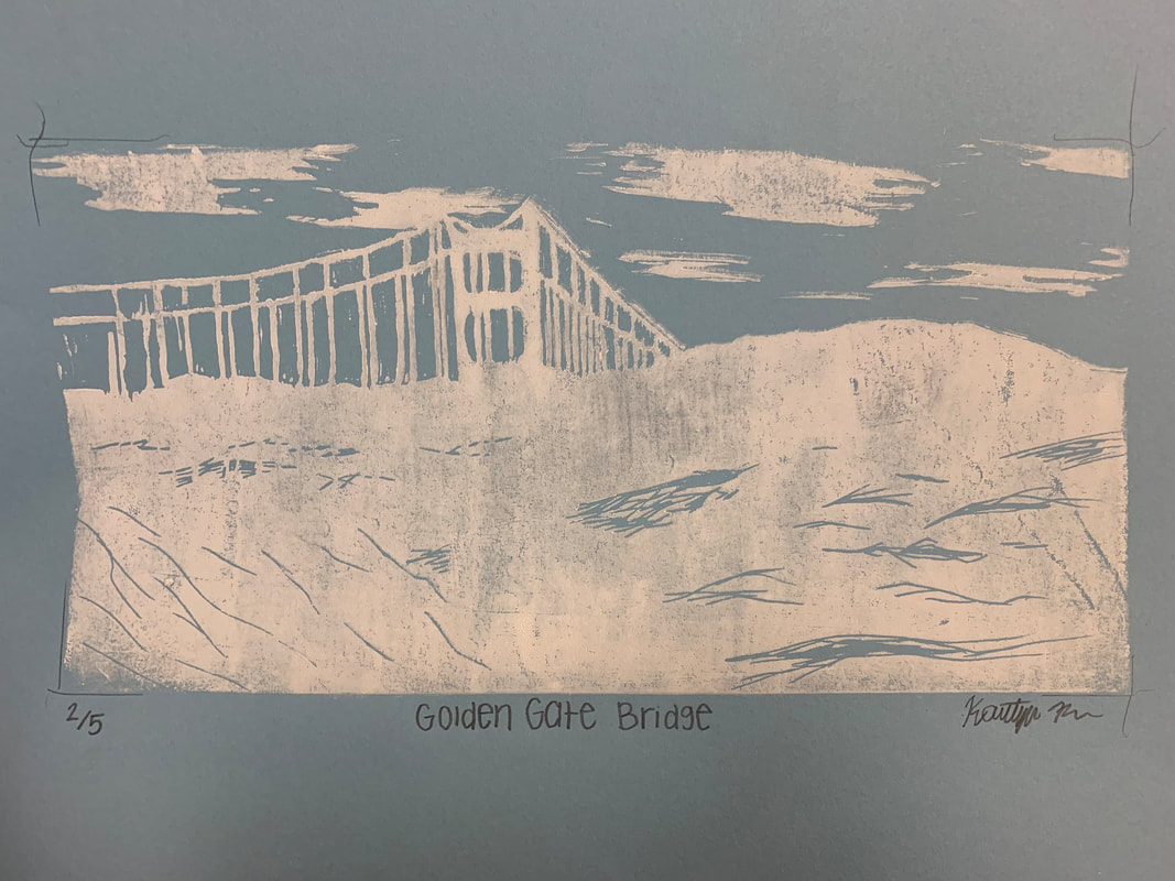
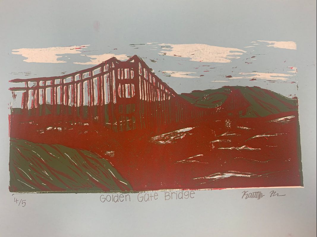
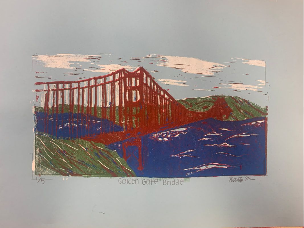
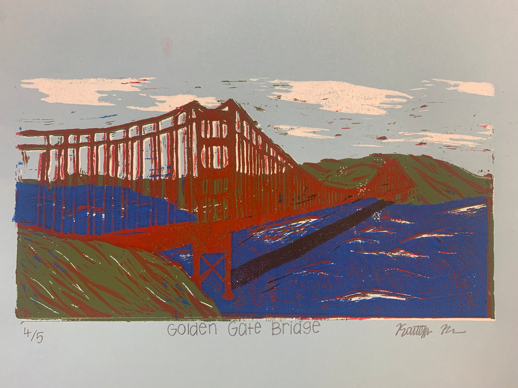
Describe the craftsmanship of your prints. (How good the project is technically crafted)-registration and carving
Overall, I wish I spent more time lining my prints up better, since the small rad parts of the bridge were very hard to line up. I think the colors and shadows of the bridge and the different layers turned out well, but some of the layers ended up in the clouds. Overall, I'd say it was pretty successful. How did you use texture, color harmony and balance to define your choice of subject? I used texture by doing highlights throughout the water and the hills by doing different layers instead of making it look flat. I used color harmony by using the bright red and darker browns/greens to make the red of the bridge pop and make that my centerpiece. |
If you could recreate your pieces what would you do differently to enhance your final outcome?
I would spend more time carving more precise with each layer and making sure that my piece was completely lined up instead of getting frustrated and pressing down quicker than I should have.
I would spend more time carving more precise with each layer and making sure that my piece was completely lined up instead of getting frustrated and pressing down quicker than I should have.
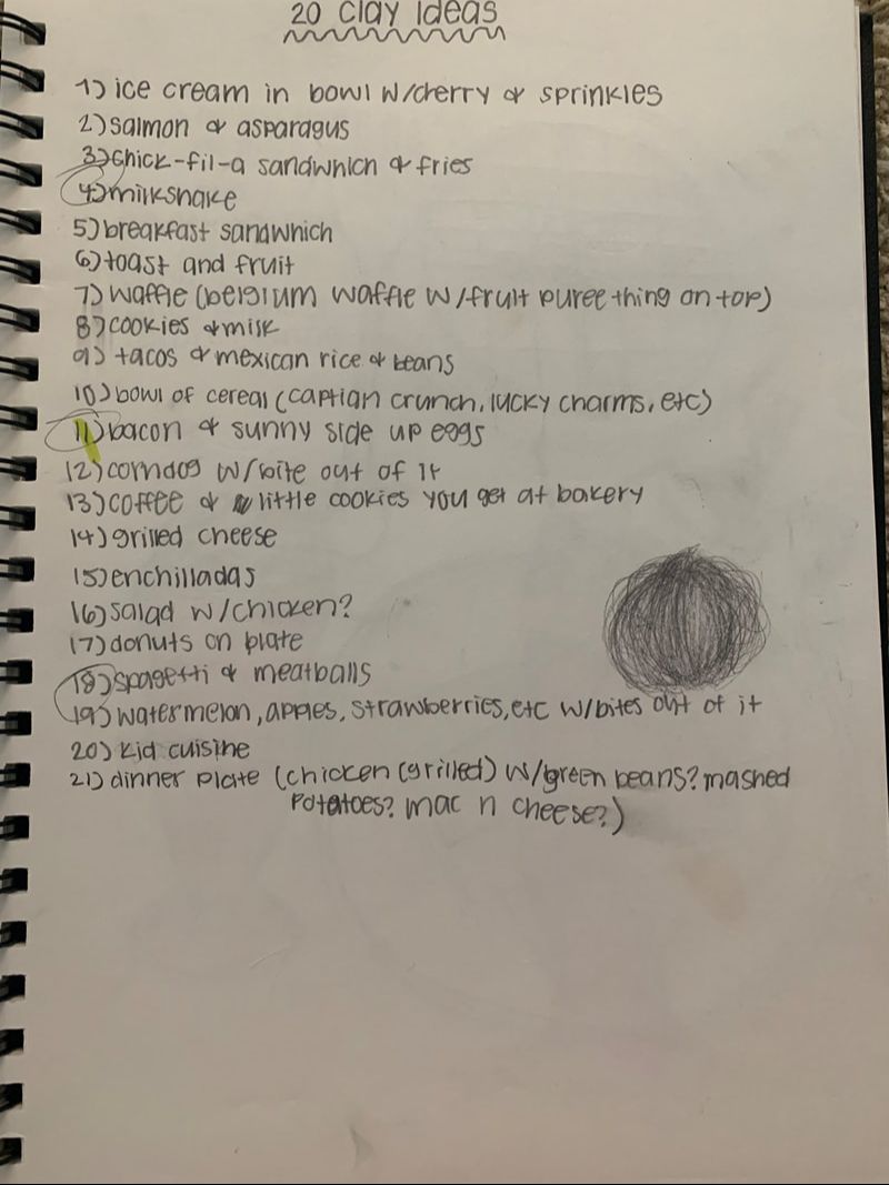
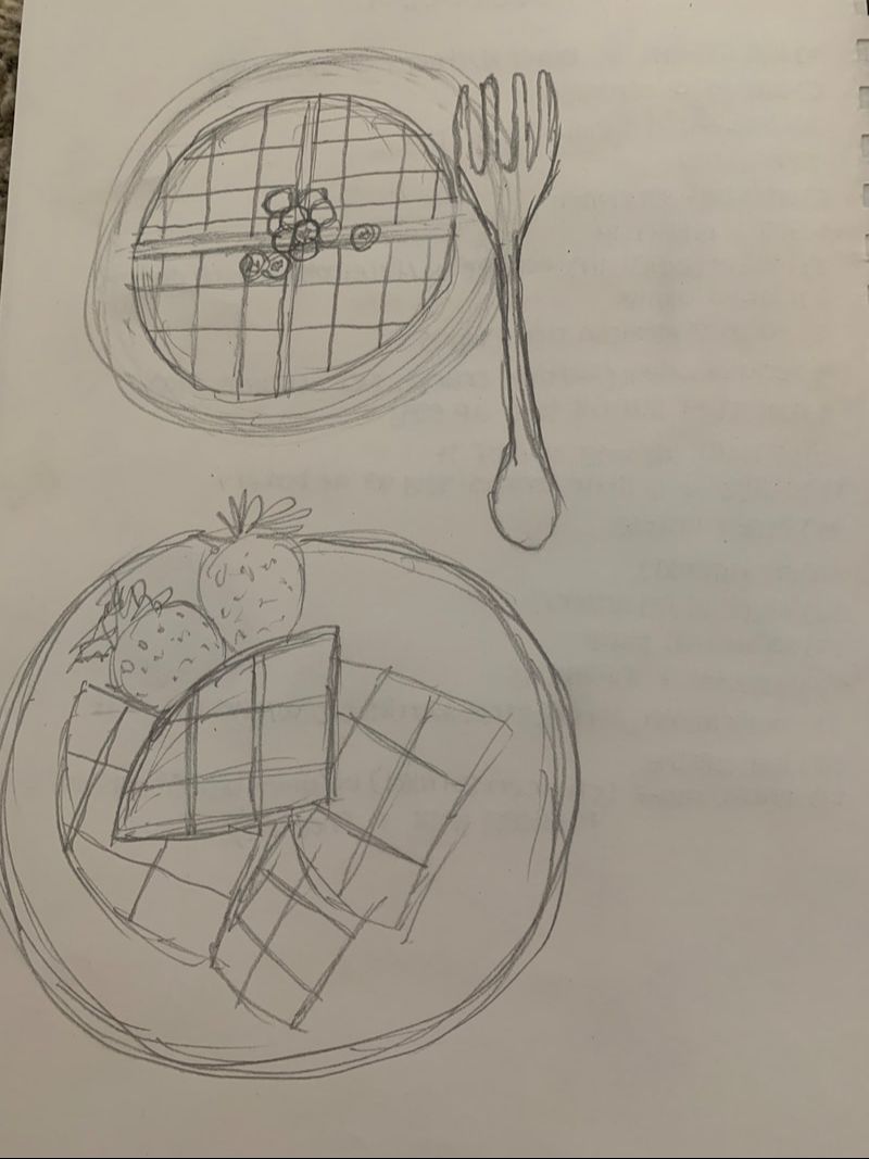
Clay Food
|
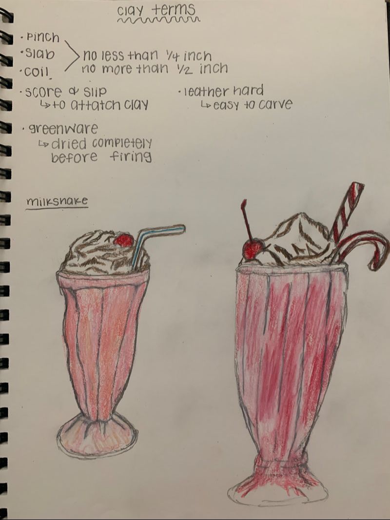
|
|
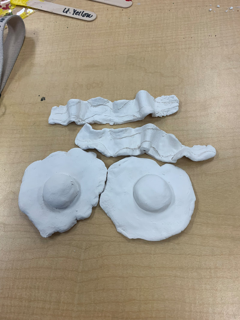
|
|
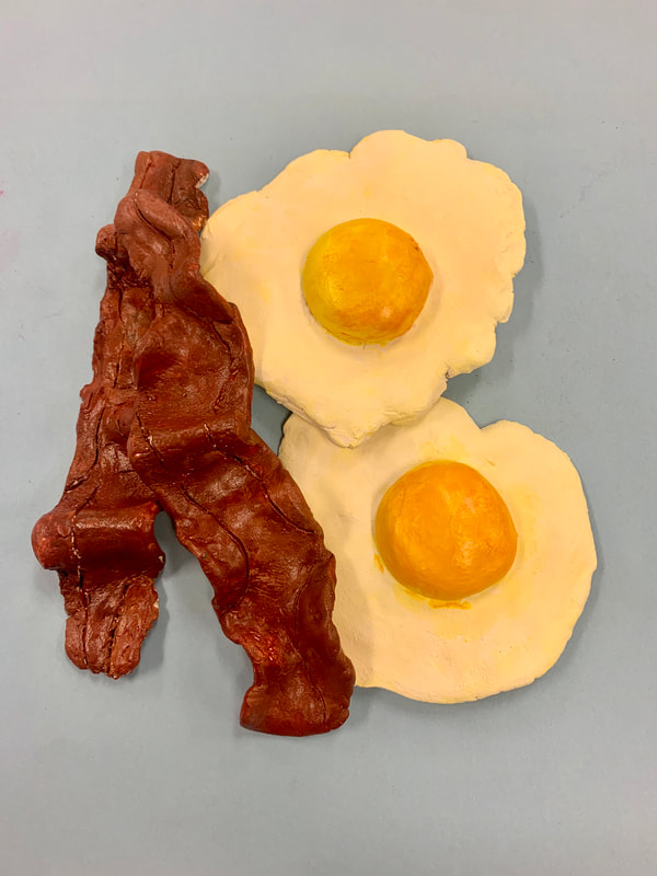
|
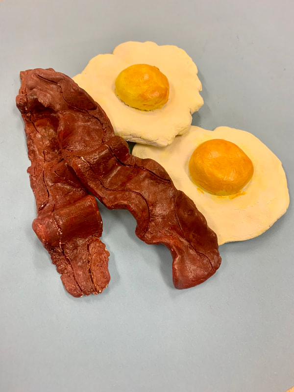
|
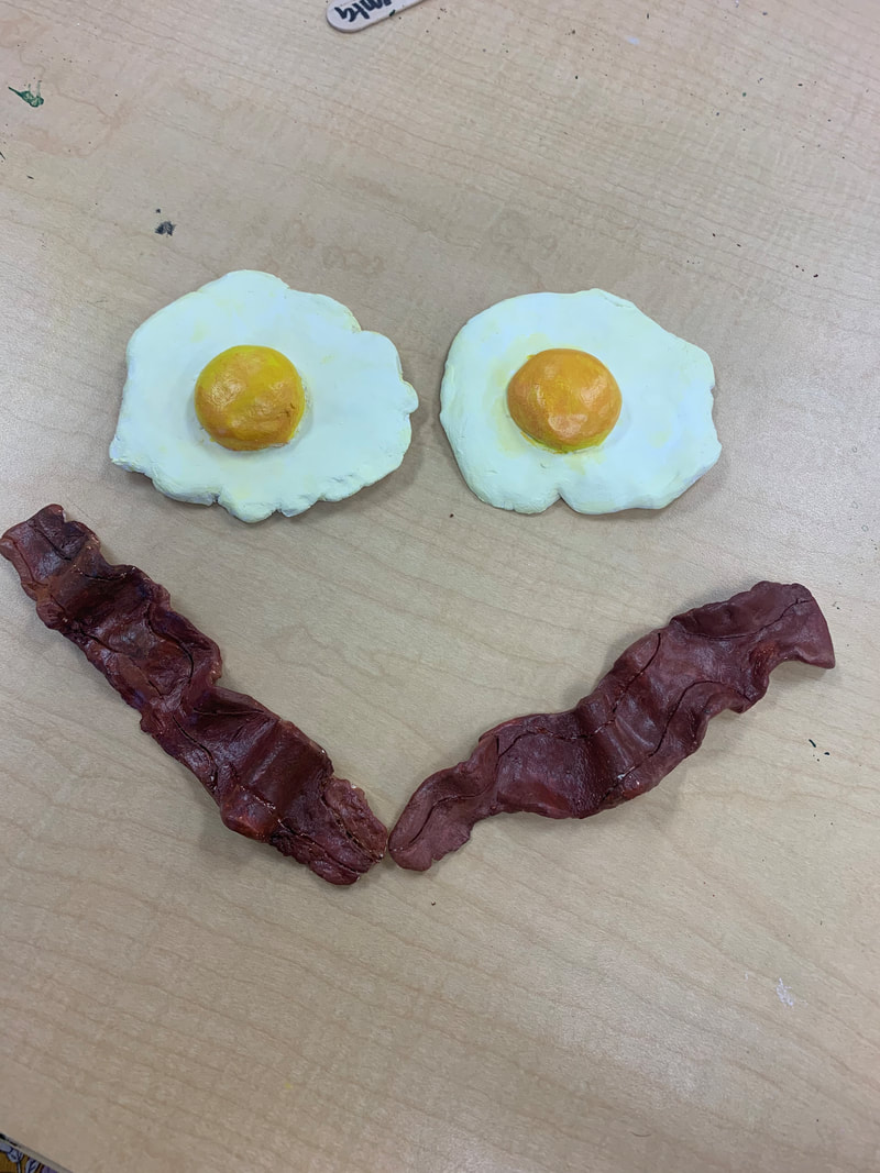
Describe the differences in constructing a sculpture and doing something 2D. With sculptures, you can't just erase part of a project when you don't like it, you have to resculpt it and use different techniques to connect and use different textures throughout the piece. Describe the craftsmanship of your sculpture. (Is it neat and well executed?) Overall, I think the paint techniques turned out okay, but I don't like the bacon as much as the eggs. I do think it looks pretty neat, but I should've painted the bottom of the bacon What was the most difficult part of this project? For me, the most difficult part was making the bacon and the different textures throughout it. I tried to do the textures and ended up smoothing it out and trying again multiple times to start over on the textures. Did your color choices work together harmoniously? Yes, I used the colors that were the normal bacon and eggs color, so it looks realistic. I like the harmony of the colors and how both the bacon and the eggs pop from one another and are very distinct and easy to see. Is your sculpture interesting from all views? Yes, I have a few pictures from multiple views and I like how it turned out from different angles, but from some angles the bacon is white on the bottom or has spots that look more rushed than others. |
How did you create textures in your sculpture?
I used textures in my bacon by using the needle tool and carving out different sections and lines to separate the crispy part of the bacon from the fatty part. This took multiple tries but in the end I'm happy with how it turned out.
Does your sculpture look like the actual food? How did you accomplish this?
Yes, I didn't think it did at first but now I've had multiple people come up to me and tell me that the bacon or eggs looked real and thought I was carrying around eggs with me. I accomplished this mostly by the different colors throughout the clay, such as adding a tiny bit of yellow in the egg white to make it look more realistic
What would you do differently if you were to do this project again?
I would spend more time making a plate for my piece to have an extra part of my clay and I would also make sure I painted the bottom of both the bacon and the eggs so you could see it in multiple angles. I would spend more time sculpting the bacon and putting some textures in eggs to make sure it looks more realistic.
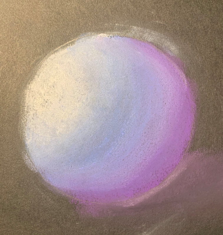
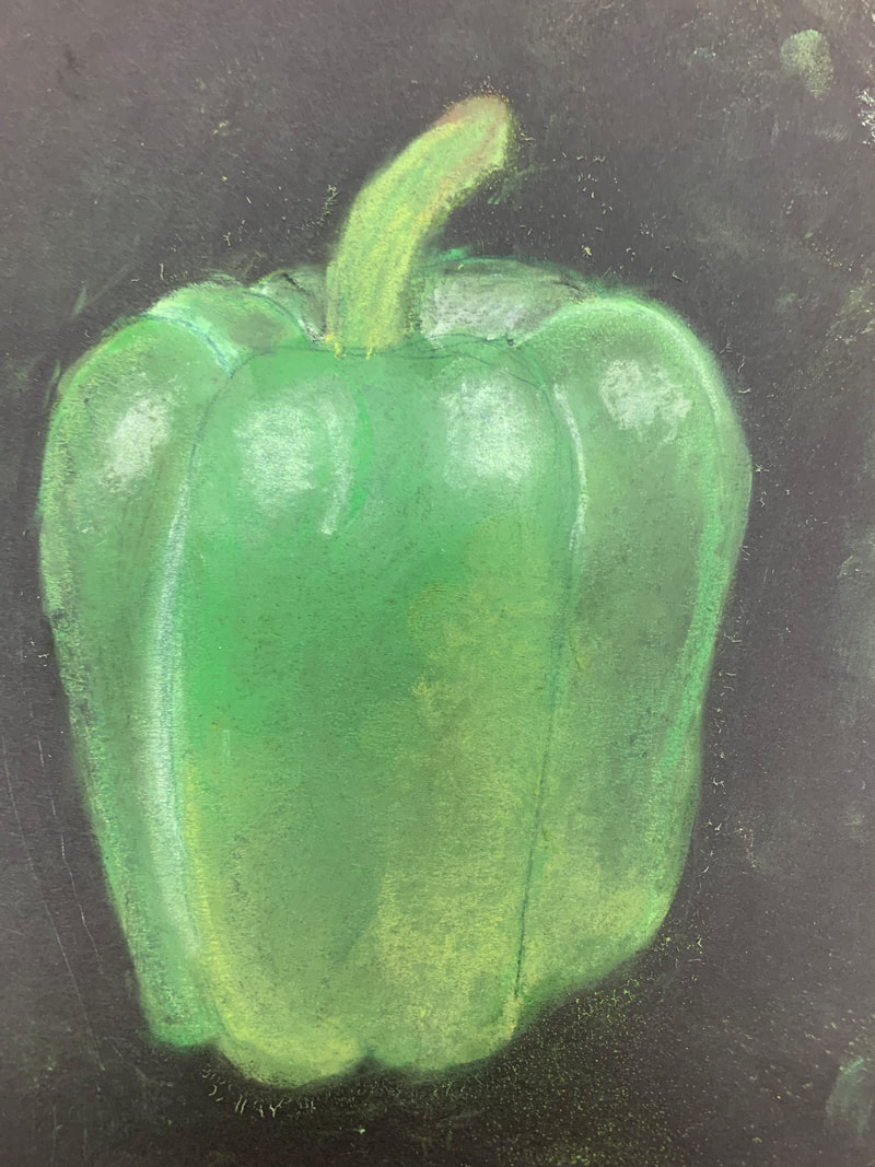
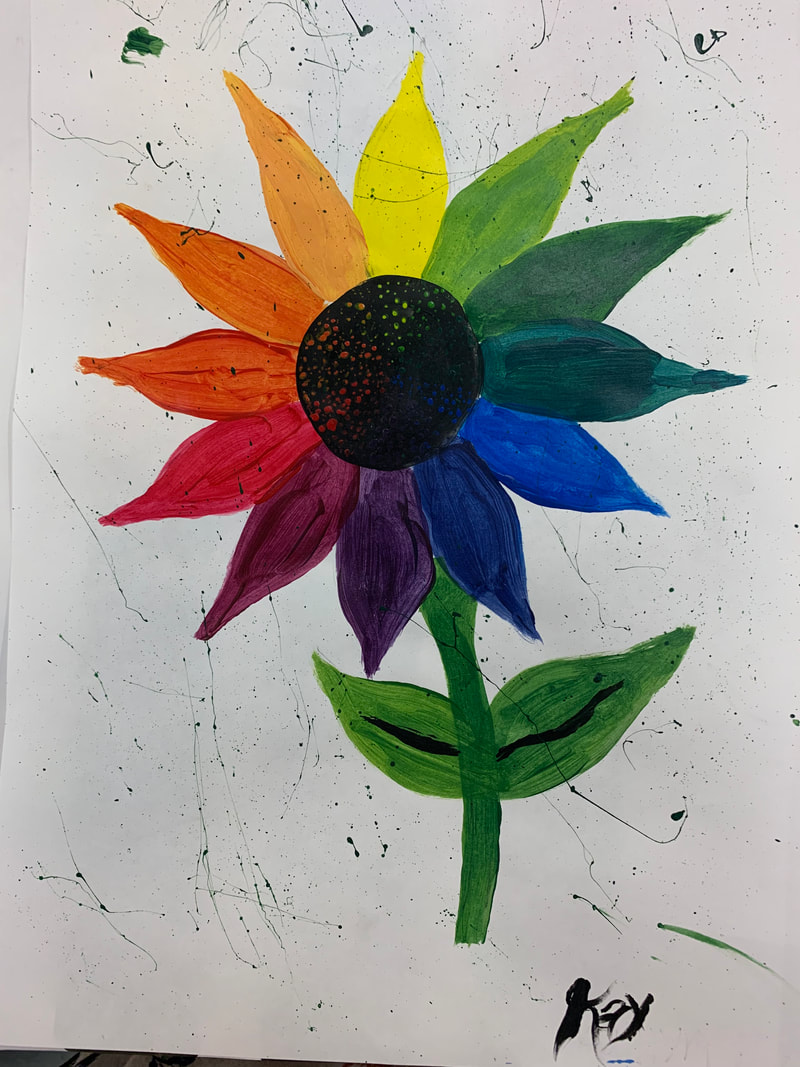
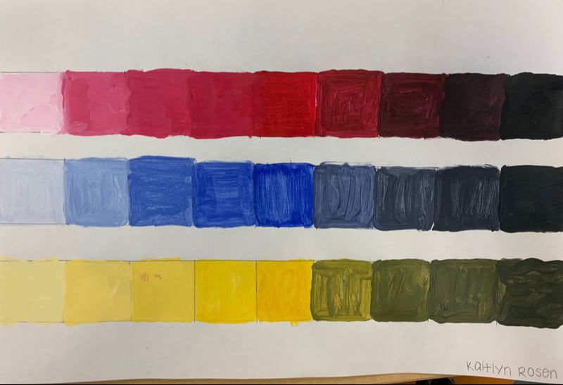
Value Chart and Color Wheel
|
|
This was an intro to the painting unit to practice blending and getting used to painting with different style brushes
