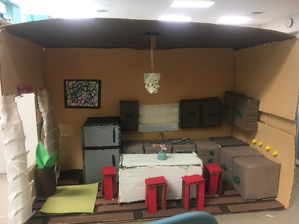
Dollhouse Kitchen
|
What was the assignment?
In this project, we needed to create a room using materials around us and using the correct lighting, color scheme, etc. My group had to do the kitchen and we choice a simple neutral theme for our project. We used cardboard for almost all of our project for counters and chairs. What color scheme did you apply?
The color scheme that my group chose was a neutral color scheme but also including complementary colors for things like the cabinet handles and the stools. |
|
What elements of design are represented?
We used color, texture, line, and form. The colors we used were shades of brown, red, and green. Almost all of our texture included cardboard but some was made using beads or fabric. Which part was the hardest?
The hardest part of this project was cutting and covering all of the cardboard with paper. It was hard to make it come out neat and clean as we made them and to keep the edges looking nice. |
What principles of design are represented?
The main principles we used were unity/harmony, scale/proportion, and balance. We portrayed unity by using repetition of colors throughout our piece. We also used repetition of texture in our room by using a lot of cardboard and beads. We used scale by making the cabinets, counters, and island proportionate to each other by height and width. Lastly, we used balance by creating an asymmetrical room since there are many cabinets and counters on the right and empty space on the left. |
|
Which part was the easiest?
The easiest part for me was probably making the chandelier. I found it easy and fun to glue all of the beads together on the bottle cap and paint over it. I also thought making the plant was fairly easy as well. |
Why did you pick this piece for your portfolio?
I picked the room because it had definitely been out biggest project so far so it's easy to critique and answer questions on. I also had a lot of opinions on this project. |
What would you do differently?
If I could do this project again, i'd rather do it individually since I had different ideas on how to make it neater than my group and we wouldn't have to worry about some people doing all the work and others do none. I would also plan way more than starting to blindly build the room and furniture since we had a lot of setbacks from not planning. Lastly, I would want a couple more days to work on this since we were rushing towards the end with trying to finish the kitchen because the kitchen had a lot more pieces to cut and glue together compared to the bedroom.
If I could do this project again, i'd rather do it individually since I had different ideas on how to make it neater than my group and we wouldn't have to worry about some people doing all the work and others do none. I would also plan way more than starting to blindly build the room and furniture since we had a lot of setbacks from not planning. Lastly, I would want a couple more days to work on this since we were rushing towards the end with trying to finish the kitchen because the kitchen had a lot more pieces to cut and glue together compared to the bedroom.
Build a Room Project
|
What was the assignment?
The assignment for this project was to create rooms out of magazines or out of pictures from the internet and put them together to create different rooms with different color schemes. The 2 rooms that I chose to represent was the kitchen and the kid's room. |
Why did you choose these for your portfolio?
I chose these 2 rooms because I thought they best represented my ability to create rooms and they looked the neatest and most clean. They also represented their color schemes well. |
--ROOM #1--
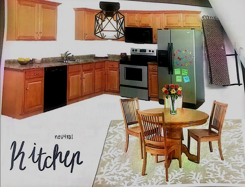
What elements of design were represented?
I used color, texture, and line throughout my room. The color was a neutral color scheme, the texture was repetitive by using the same color and texture of wood throughout the room, and the lines throughout were mostly straight. The only curved lines that I had were on the circular table and the chairs. |
What color scheme did you use?
The color scheme that I used for this was neutral. I used browns, whites, tans, silvers, and blacks throughout my room. What principles of design were represented?
I used unity and harmony within my color scheme. I used a repetition of the wood color for my table and counter and both the stove and the fridge were the same shade of silver. I also used scale/proportion to make the rug, table, and counters all proportionate to each other so the room didn't look weird. Which part was the hardest?
I thought the hardest part of this room was finding the correct fabric for the windows that represented this room the best and fit the color scheme. |
|
Which part was the easiest?
The easiest part of this room was finding the furniture for the color scheme. I thought a neutral color scheme was able to give me a lot of options for this room and there were many furniture choices that I could use. |
What would you do differently?
I would probably work on making the curtains look better and not just pieces of fabric glued to the middle of the page. |
--ROOM #2--
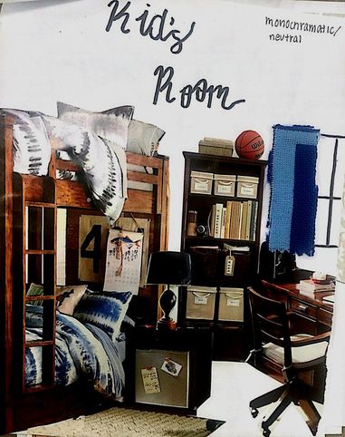
What elements of design were represented?
I used color, texture, and line throughout my room. The color was a neutral color scheme and a monochromatic color scheme, the texture was repetitive by using the same color and texture of wood throughout the room, and the lines throughout were mostly straight. The only curved lines that I had were on the chair and lamp. What would you do differently?
I would probably do the same thing on room #1 as this room, work on making the curtains look better and not just pieces of fabric glued to the middle of the page. |
What color scheme did you use?
The color scheme that I chose for this room was a mix of monochromatic and neutral. The bed frame, desk, and bookshelf were all neutral colors and the bedspread and fabric was a monochromatic color scheme using blue. What principles of design were represented?
I used unity and harmony within my color scheme. I used a repetition of the wood color for my bookshelf, bedframe, and desk and both the bedspread and the fabric were different shades of blue. I also used scale/proportion to make the rug, bed, and desk all proportionate to each other so the room didn't look weird. Which part was the hardest?
I thought the hardest part of this room was finding the correct fabric for the windows that represented this room the best and fit the color scheme. Which part was the easiest?
The easiest part of this room was finding the furniture for the color scheme. I thought a neutral color scheme was able to give me a lot of options for this room and there were many furniture choices that I could use. |
